
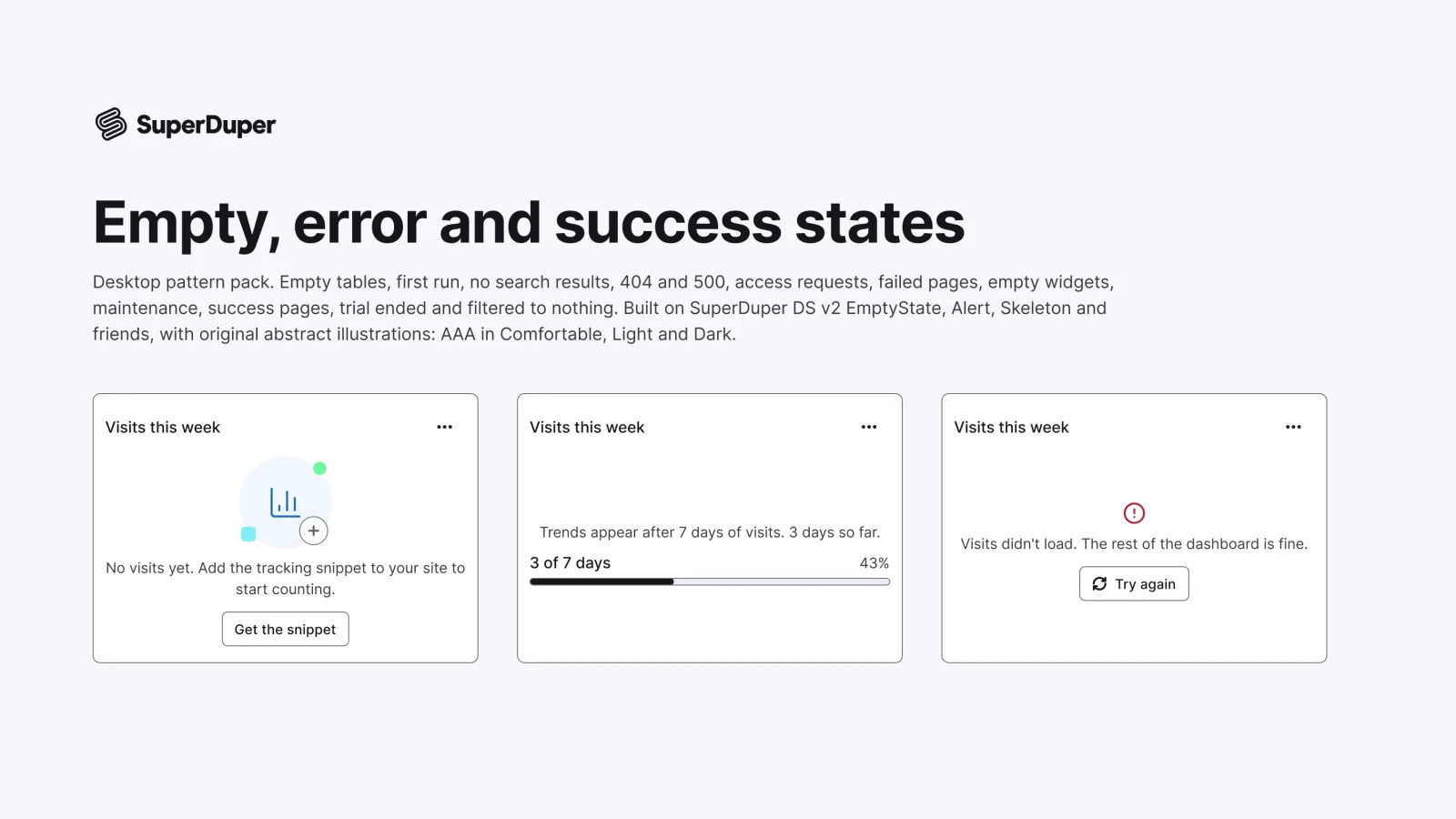
Empty, error and success states
Desktop11 components28 variants3 recreations
Desktop empty tables, first runs, no results, 404 and 500 pages, access requests, maintenance and success states.
$9, or included with Pro
Desktop packOverlays and feedback
Desktop dropdowns, submenus, context menus, popovers, tooltips, toggletips, hover cards and coachmark tours.
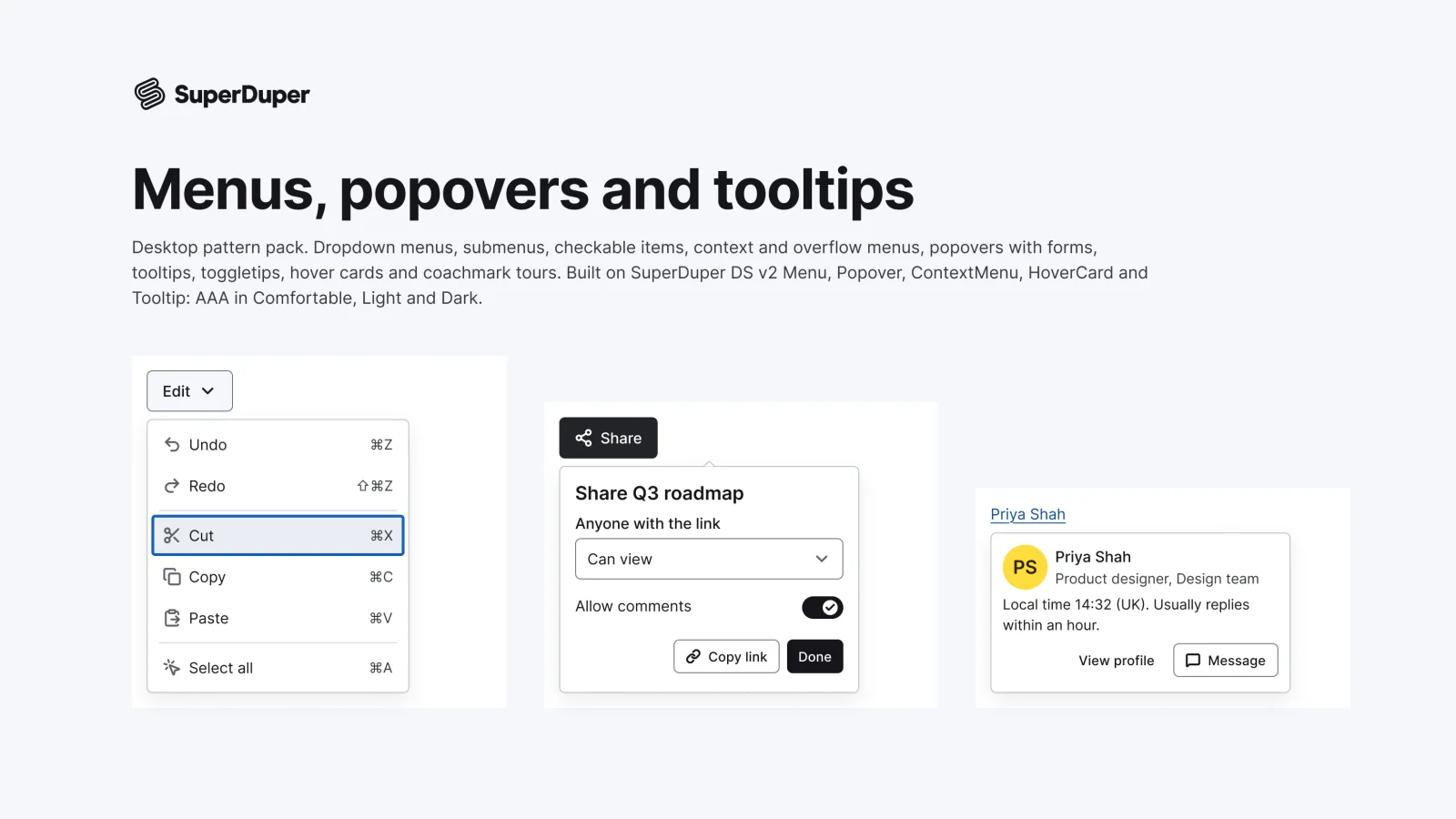
Also for mobile: Menus, popovers and tooltips
Ten overlay patterns for web apps: dropdown, submenu, checkable and context menus, overflow menus, form popovers, tooltips, toggletips, hover cards and coachmark tours. Menus and popovers use slots, so you can edit items and fields without detaching. Each page documents keyboard and screen reader behaviour, motion and when to use each overlay.
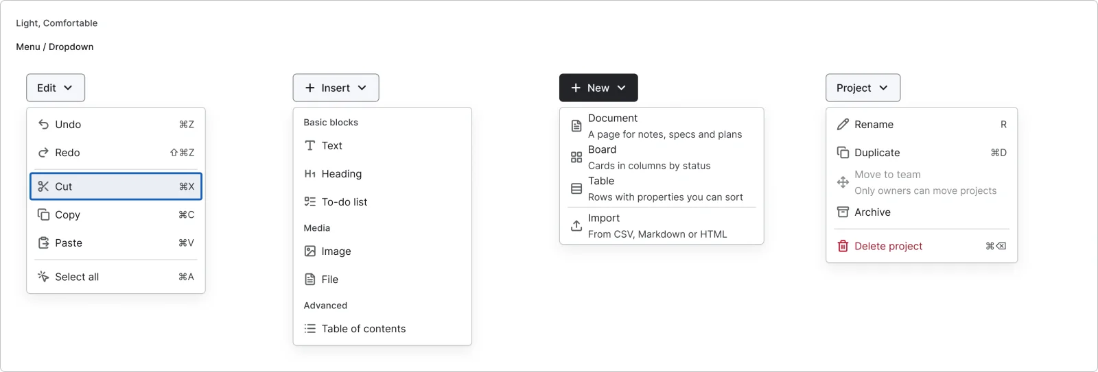
4 variants
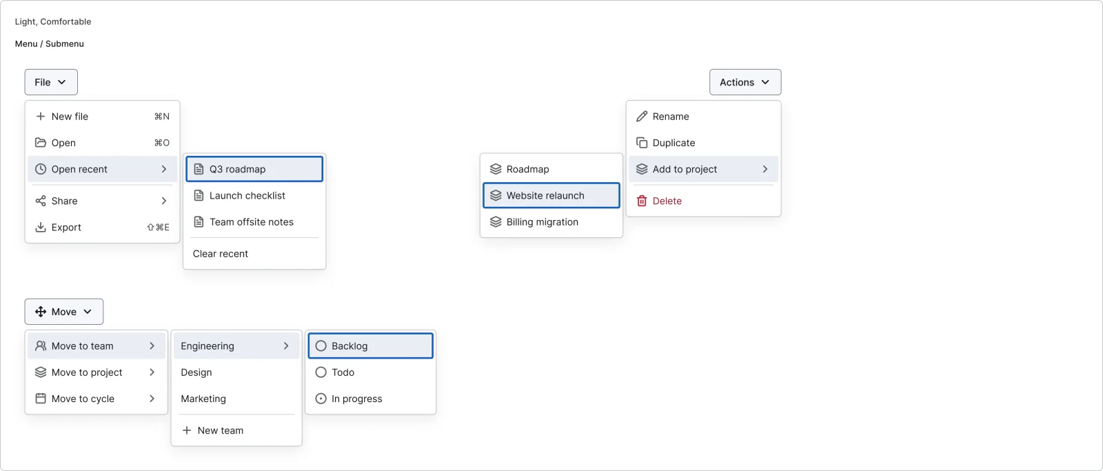
3 variants
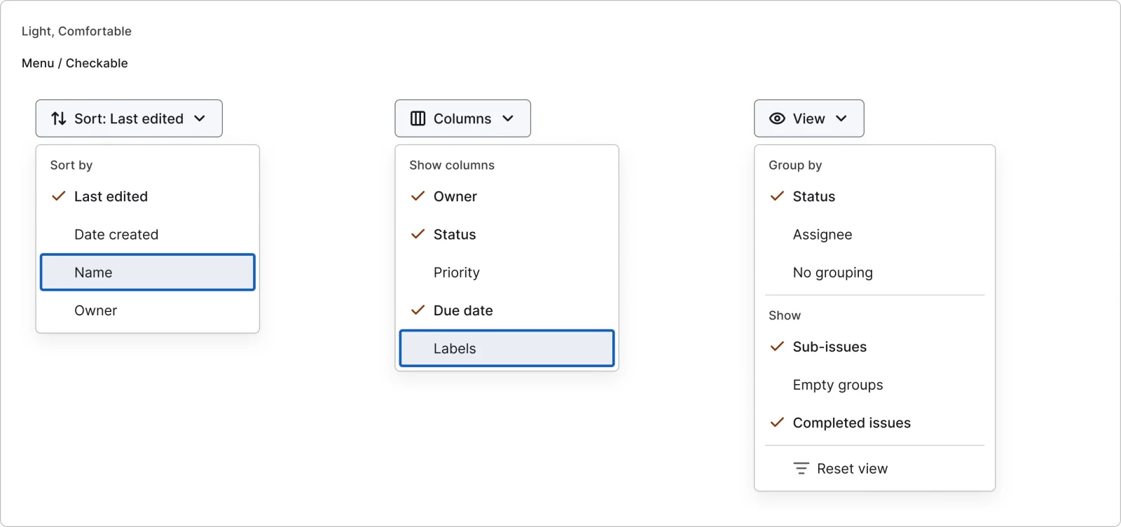
3 variants
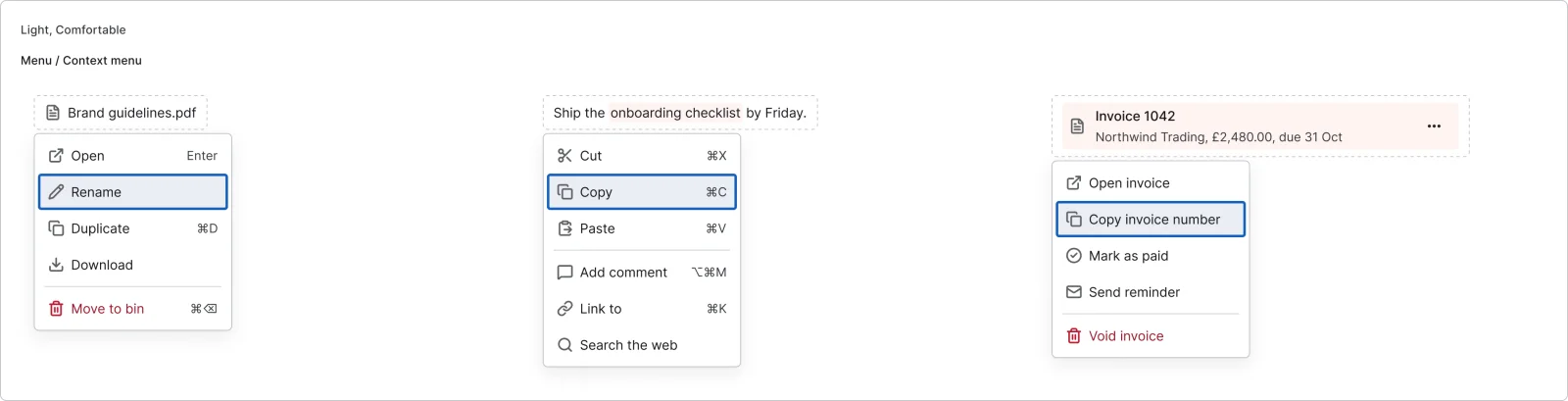
3 variants
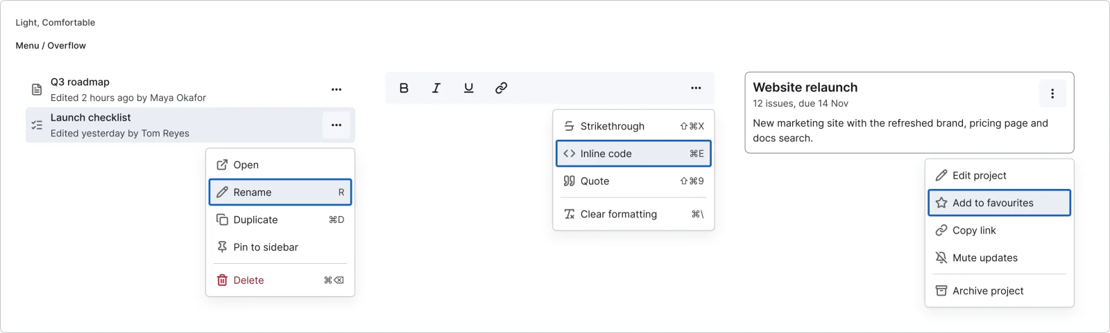
3 variants
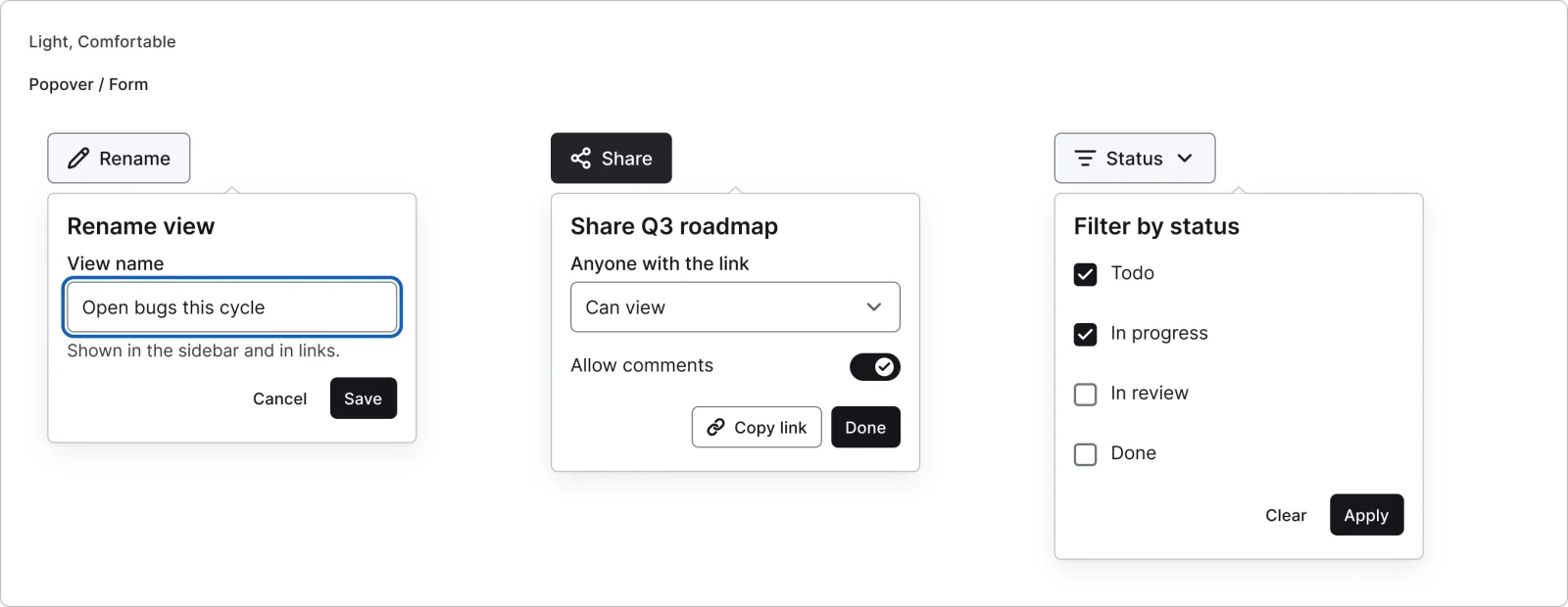
3 variants
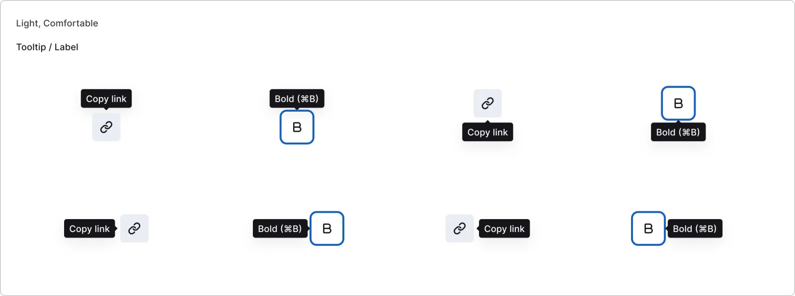
8 variants
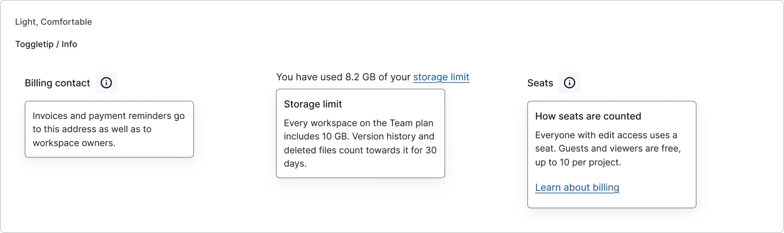
3 variants
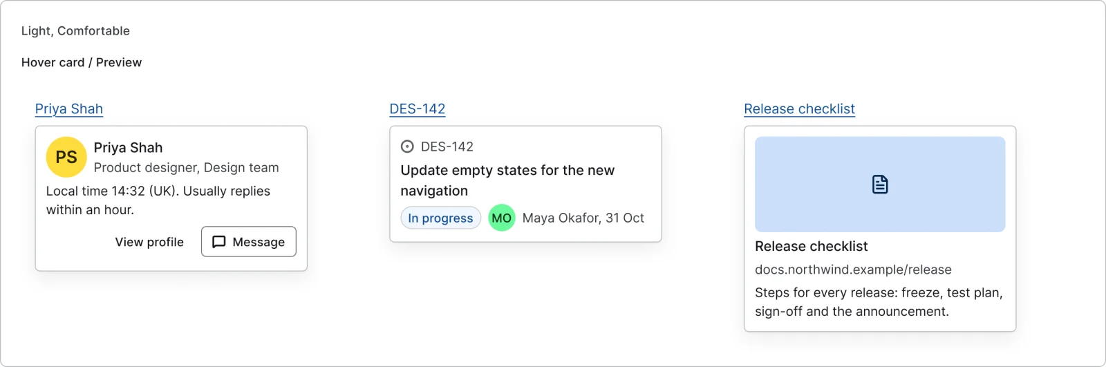
3 variants
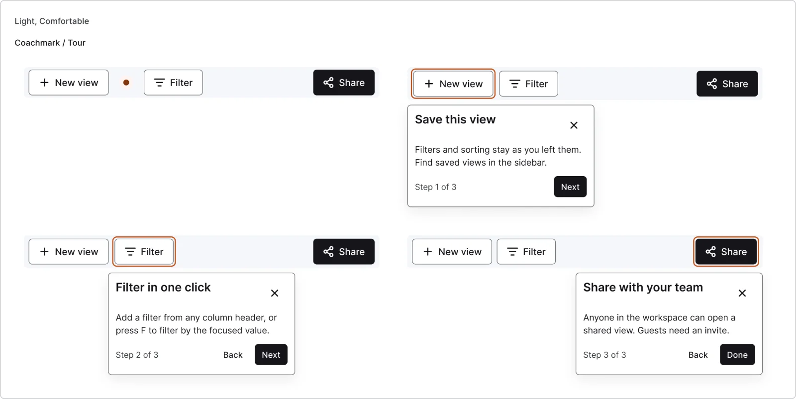
4 variants
Recreations of real products, so you can compare approaches side by side. They are approximate, built from public product knowledge, with placeholder data and no third-party artwork.

Recreated from Linear
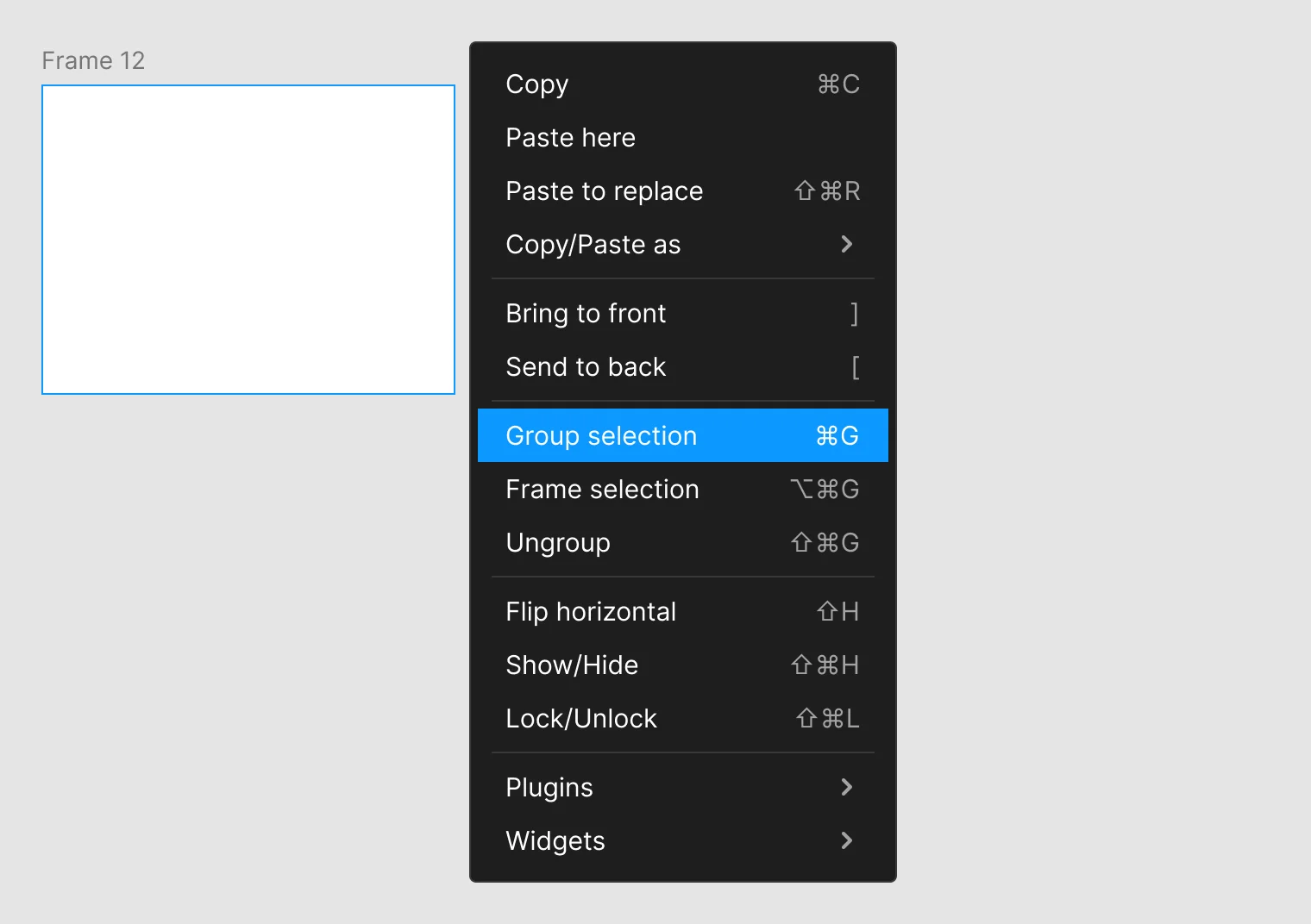
Recreated from Figma
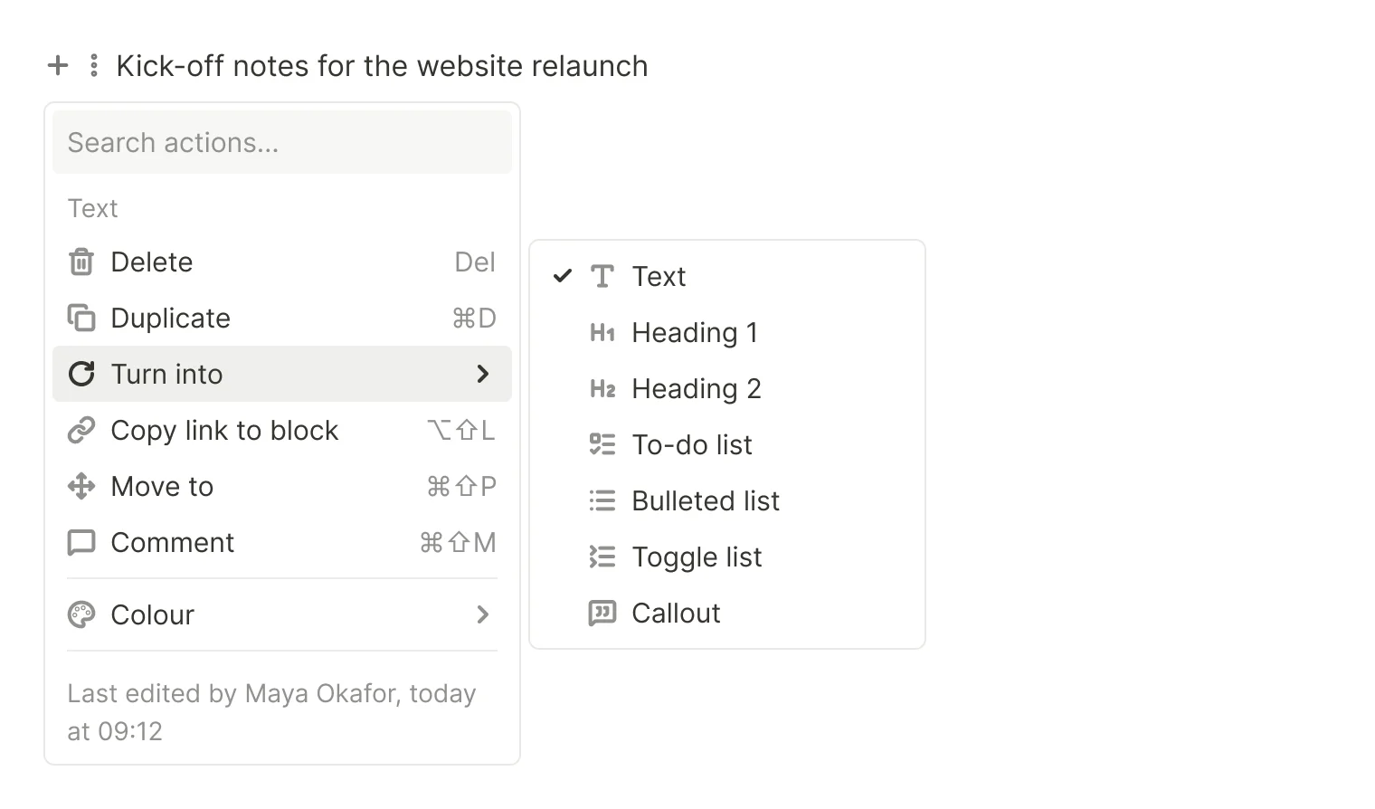
Recreated from Notion
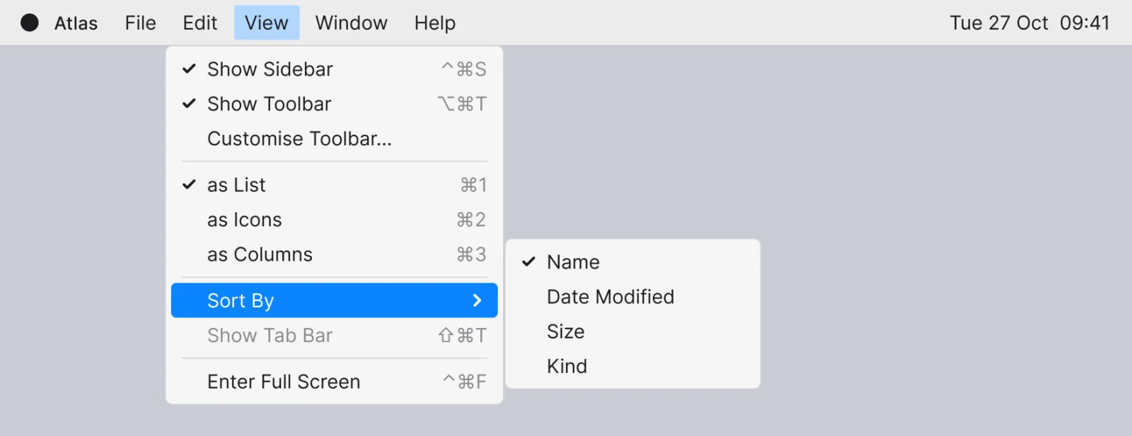
Recreated from macOS
Not affiliated with, endorsed or sponsored by Linear, Figma, Notion and macOS. Their names are trade marks of their owners and are used only to say what each recreation is based on.
A dropdown menu with icons and shortcuts, sections, descriptions, and disabled and destructive items. All 4 variants, free to see with a SuperDuperUI account. The Figma file comes with the pack.
Desktop11 components28 variants3 recreations
Desktop empty tables, first runs, no results, 404 and 500 pages, access requests, maintenance and success states.
$9, or included with Pro
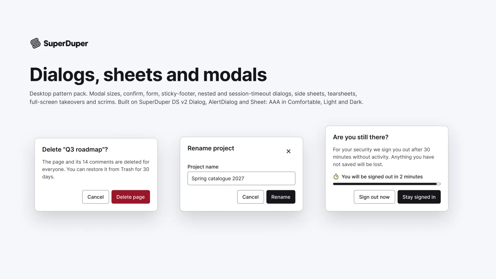
Desktop10 components35 variants4 recreations
Desktop dialogs in four sizes, confirms, form dialogs, side sheets, tearsheets, full-screen modals and scrims.
$9, or included with Pro
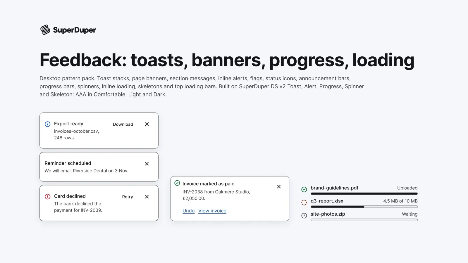
Desktop12 components60 variants3 recreations
Desktop feedback patterns: toast stacks, page banners, messages, flags, status icons, progress bars, spinners and skeletons.
$9, or included with Pro
One Figma file: SuperDuper Pack: Menus, popovers and tooltips (Desktop). It has 10 components with 37 variants, 4 recreations, and notes on when to use each part. Everything uses Figma variables, so you can change the colours and type to match your product.