Skip to content

Selection controls (Mobile)

Mobile packActions and input

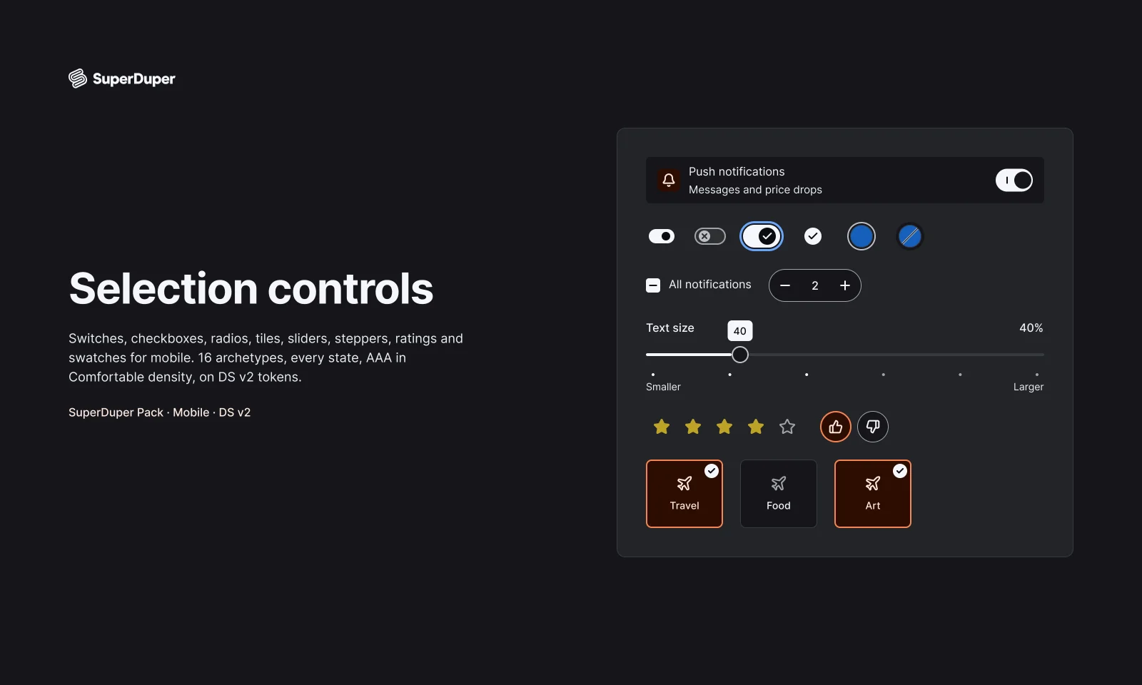
Mobile switches, checkboxes, radios, sliders, steppers, ratings and swatches, each with every state drawn and documented.
components
19
variants
216
recreations
3
themes
5

Also for desktop: Selection controls

What’s inside

Sixteen mobile selection patterns in 19 components, from switch sizes and select-all checkbox groups to range sliders, guest counters, star ratings and colour swatches. Every set covers pressed, focus, disabled and, where it applies, invalid, indeterminate and loading states. Each page documents use, anatomy, screen reader behaviour, motion and haptics for iOS and Android.
  • Indeterminate, invalid, muted and unavailable states included
  • Haptics and motion tables for iOS and Android on every page
  • Recreations of Airbnb, Duolingo and Revolut controls
  • Switch sizes, every variant

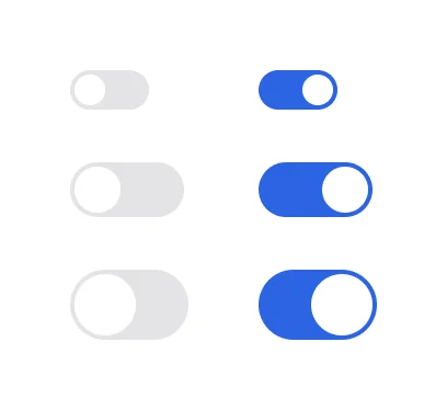
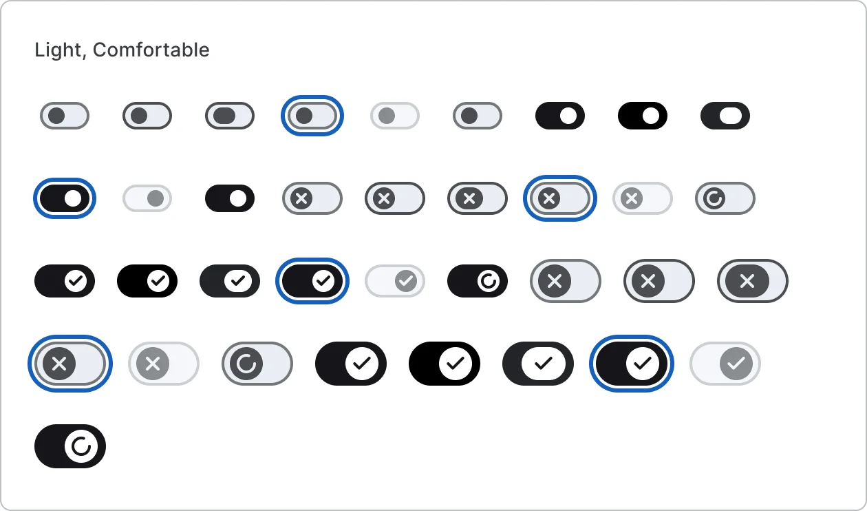
    Switch sizes

    Free sample

    36 variants

    • Small
    • Medium
    • Large
    • Off
    • On
    • Default
    • Hover
    • Pressed
    • +3 more
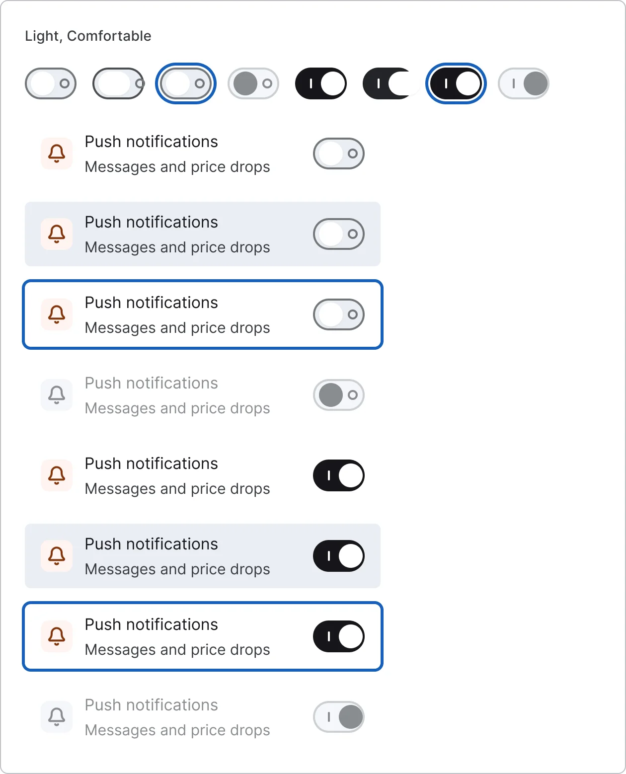
  • App styled switch, every variant

    App styled switch

    8 variants

    • Off
    • On
    • Default
    • Pressed
    • Focus
    • Disabled
  • Switch setting row

    8 variants

    • Off
    • On
    • Default
    • Pressed
    • Focus
    • Disabled
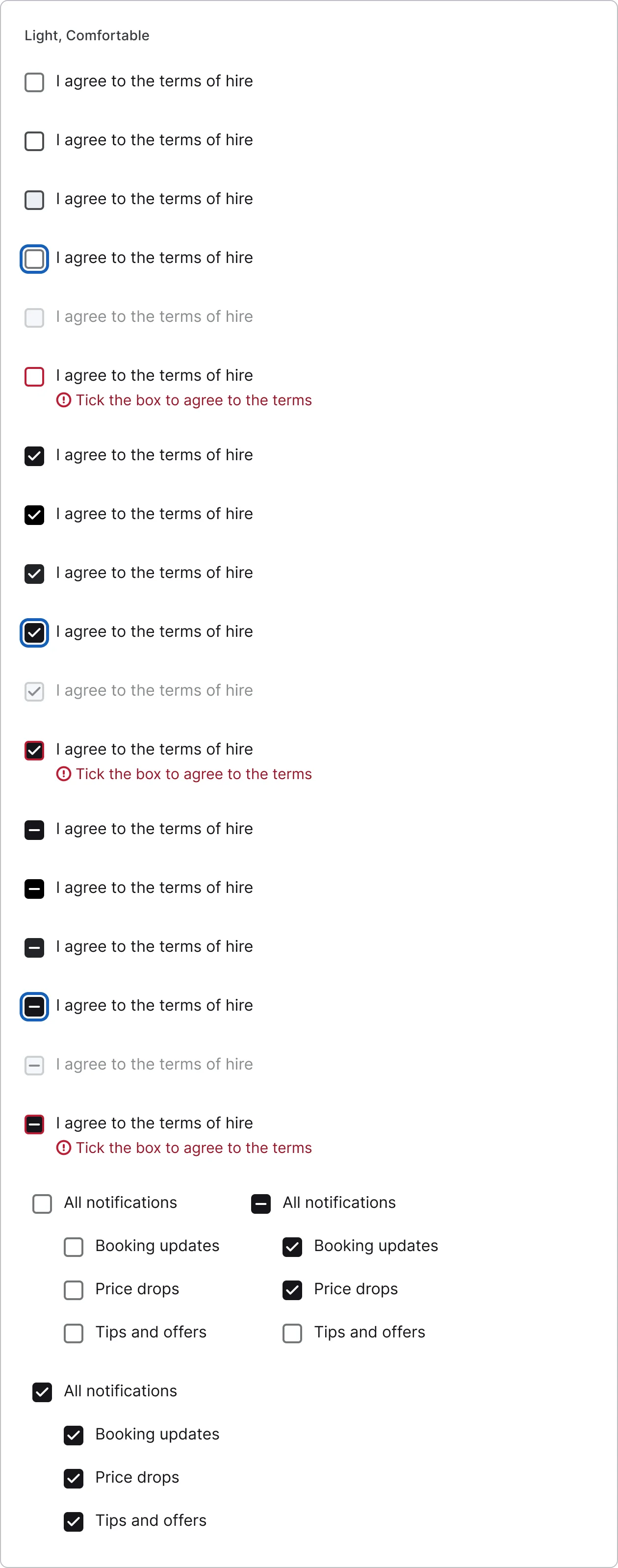
  • Square checkbox, every variant

    Square checkbox

    18 variants

    • Off
    • On
    • Indeterminate
    • Default
    • Hover
    • Pressed
    • Focus
    • Disabled
    • +1 more
  • Select all checkbox group

    3 variants

    • None
    • Some
    • All
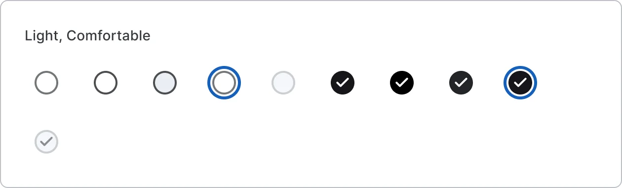
  • Circle checkbox, every variant

    Circle checkbox

    10 variants

    • Off
    • On
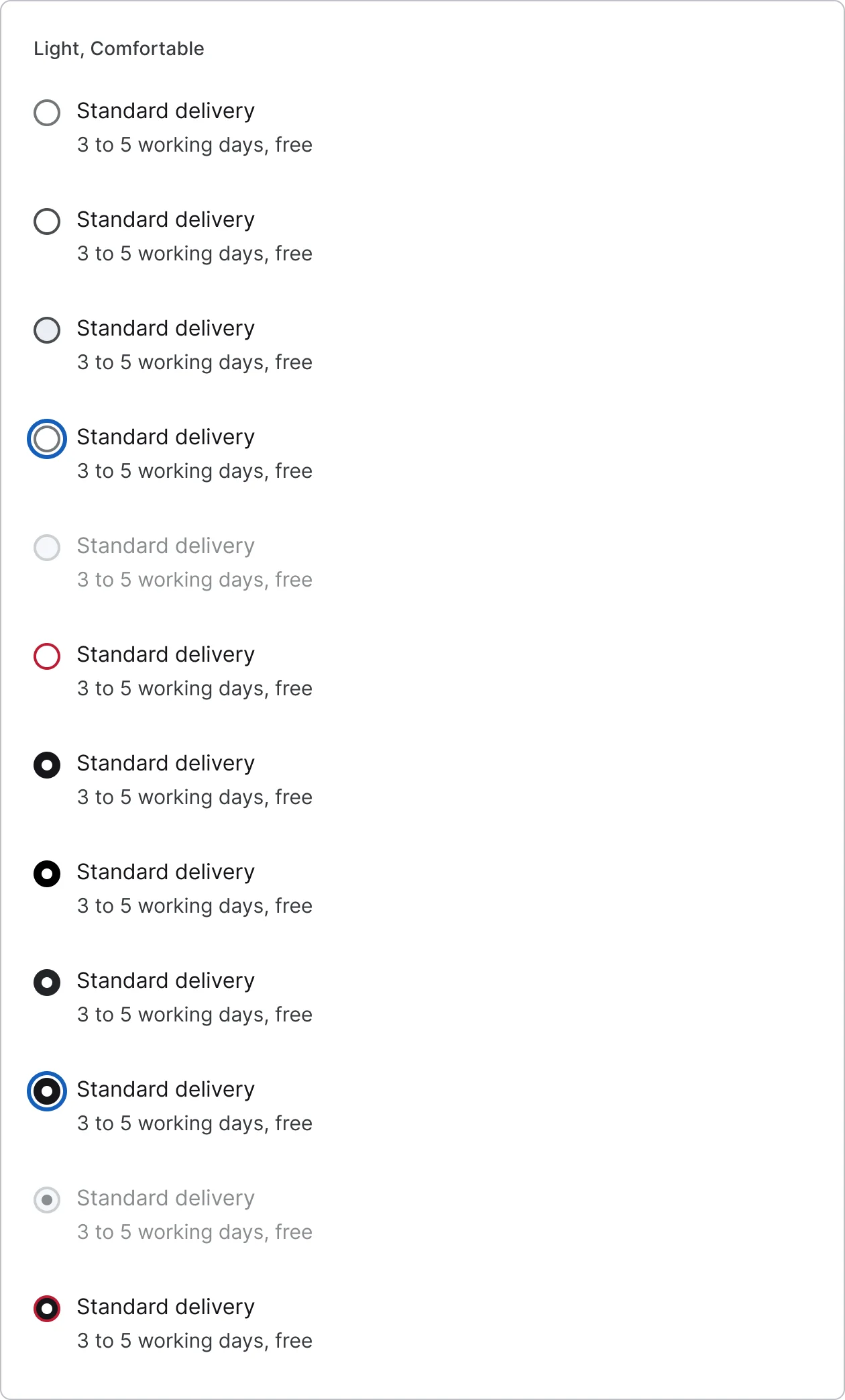
  • Radio button, every variant

    Radio button

    12 variants

    • Off
    • On
    • Invalid
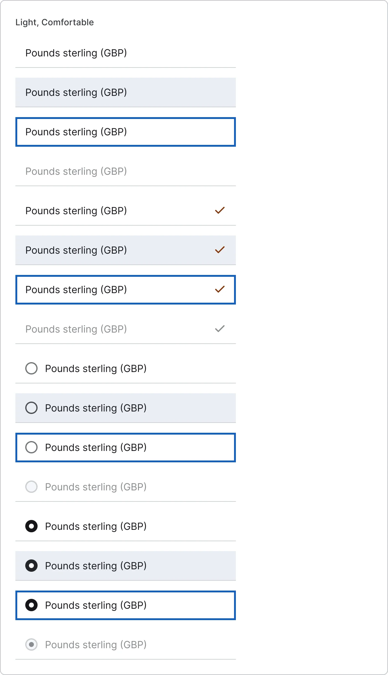
  • Radio list rows, every variant

    Radio list rows

    16 variants

    • Trailing check
    • Leading radio
    • Off
    • On
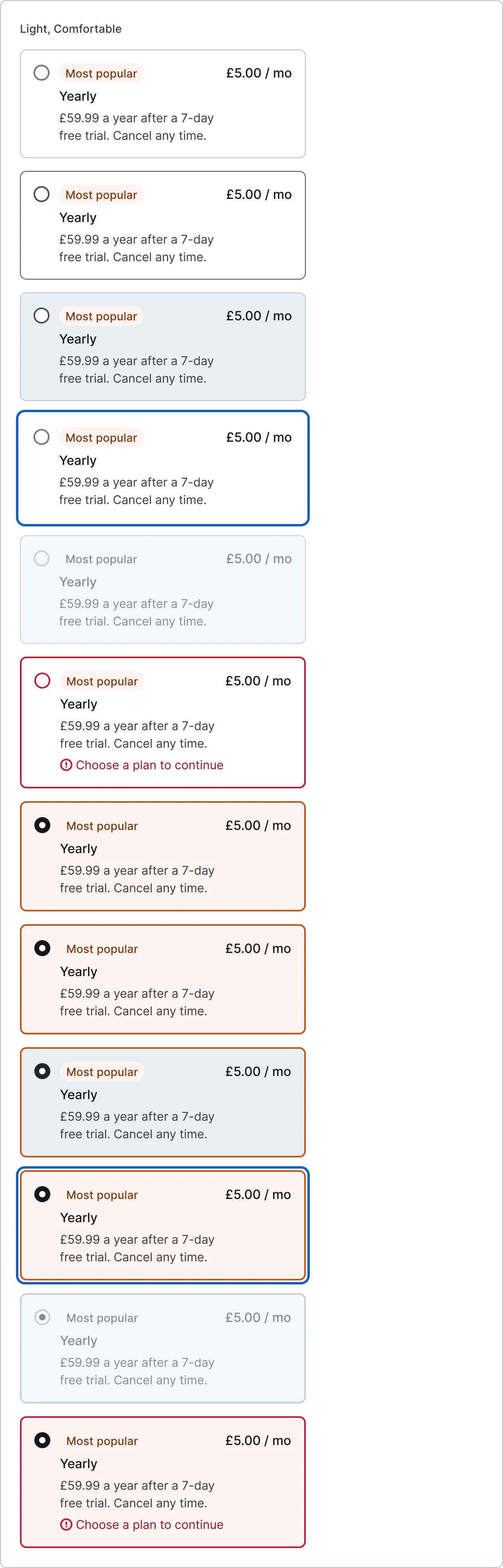
  • Radio cards, every variant

    Radio cards

    12 variants

    • Off
    • On
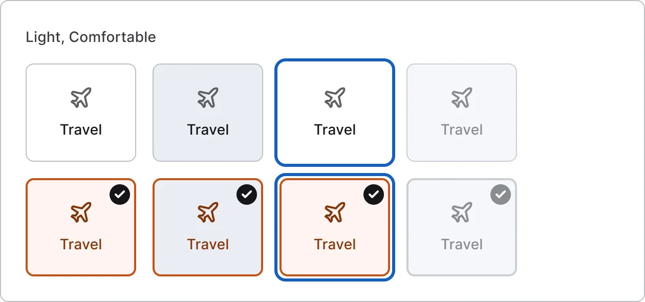
  • Selectable tile, every variant

    Selectable tile

    8 variants

    • Off
    • On
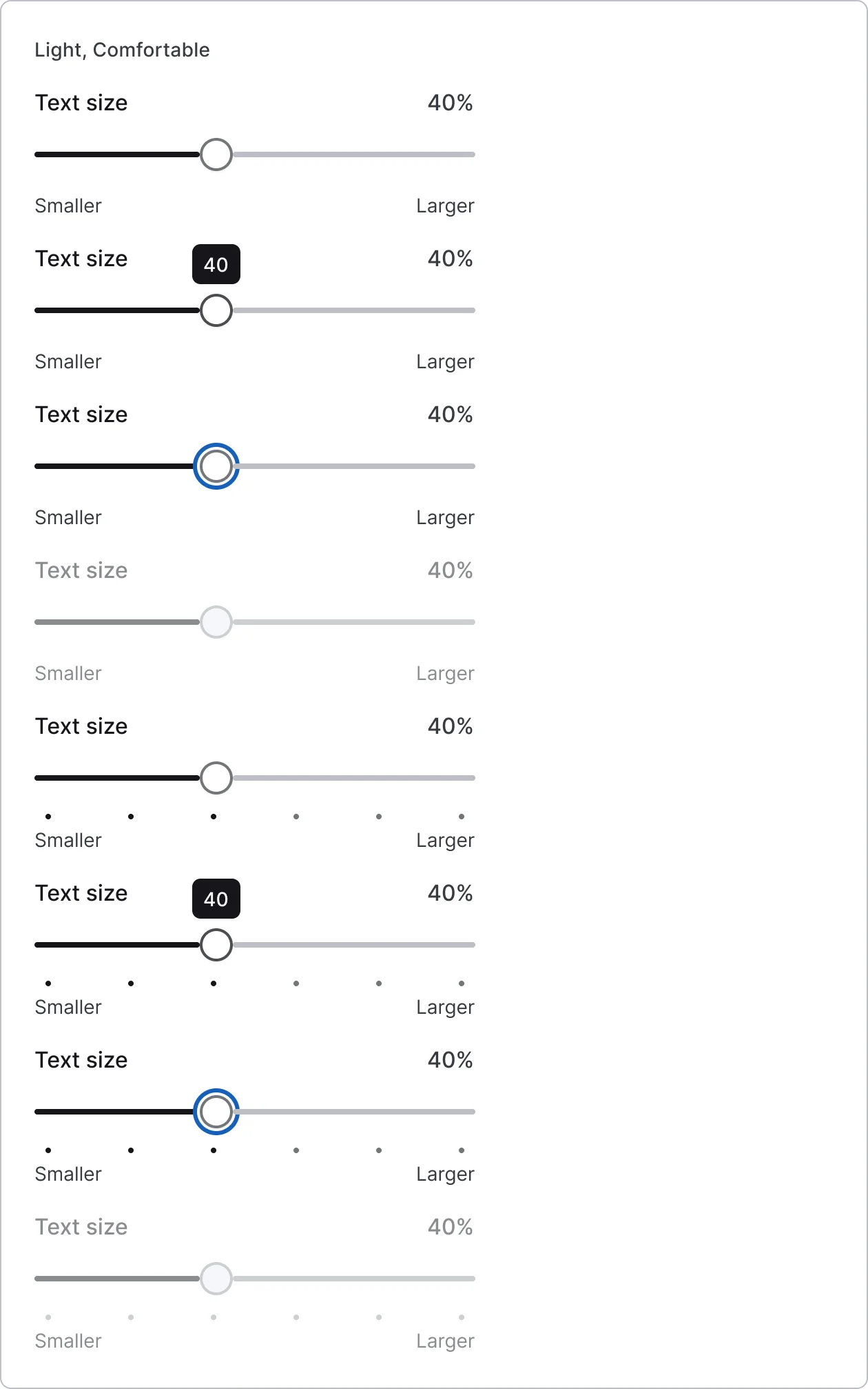
  • Single slider, every variant

    Single slider

    8 variants

    • Continuous
    • Stepped
    • Default
    • Pressed
    • Focus
    • Disabled
  • Range slider, every variant

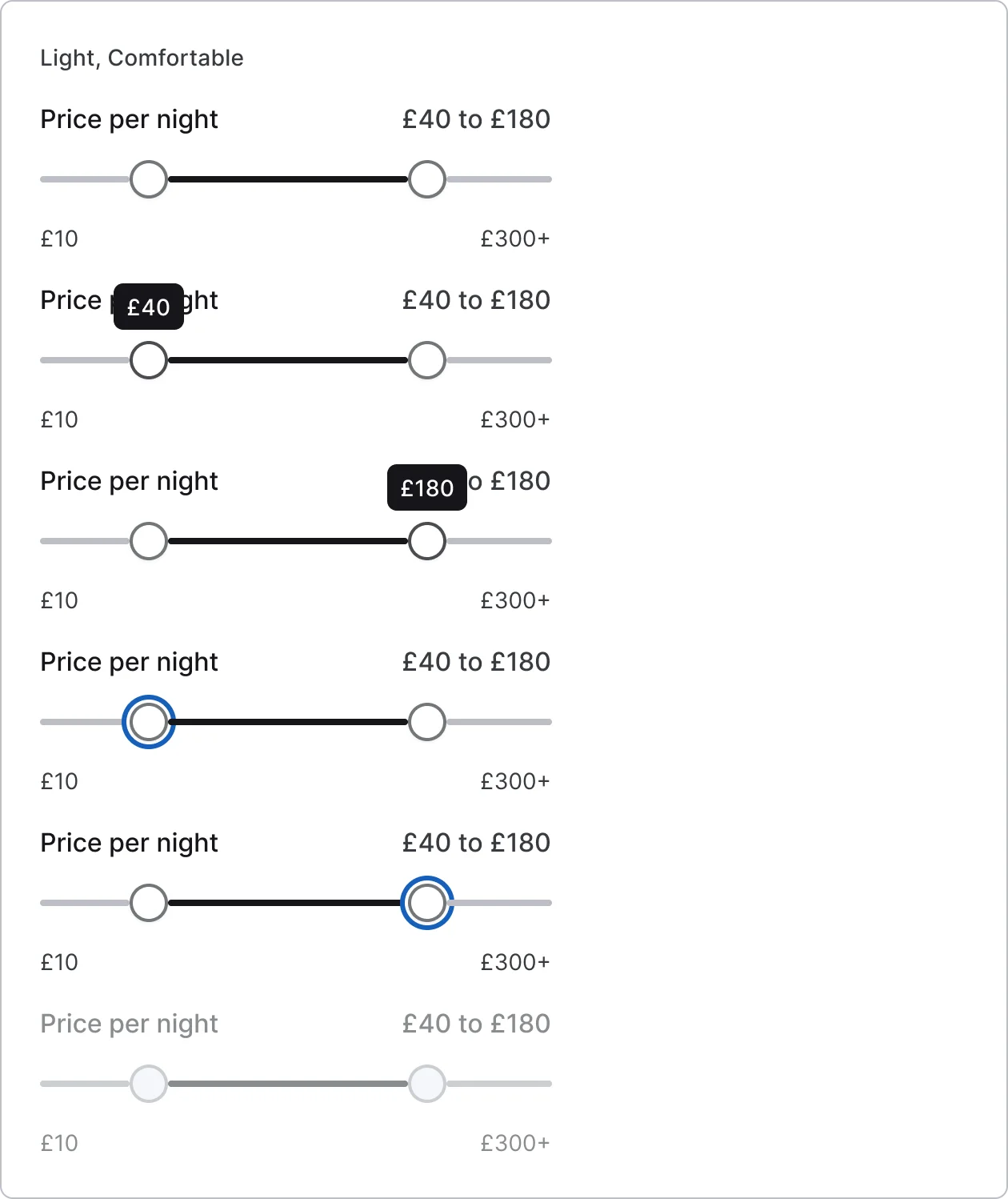
    Range slider

    6 variants

    • Default
    • Pressed start
    • Pressed end
    • Focus start
    • Focus end
    • Disabled
  • Volume slider, every variant

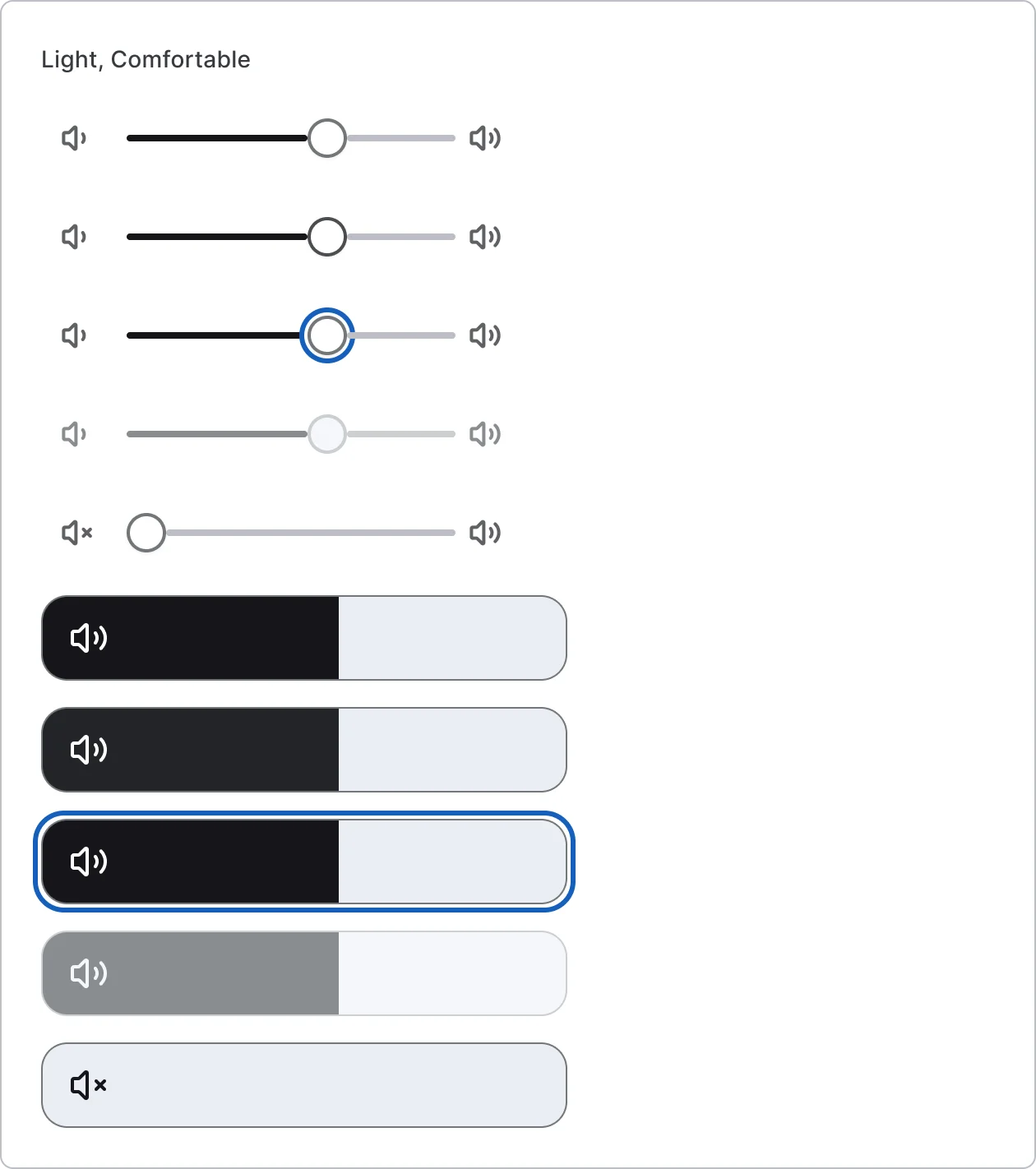
    Volume slider

    10 variants

    • Inline
    • Panel
    • Default
    • Pressed
    • Focus
    • Disabled
    • Muted
  • Quantity stepper, every variant

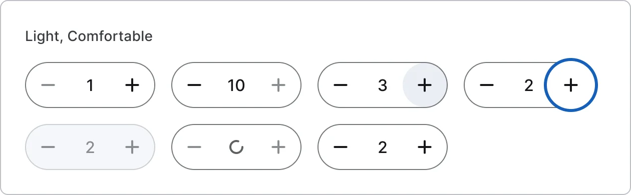
    Quantity stepper

    7 variants

    • Default
    • At minimum
    • At maximum
    • Pressed
    • Focus
    • Disabled
    • Loading
  • Guest counter stepper, every variant

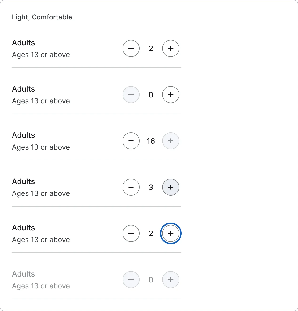
    Guest counter stepper

    6 variants

    • Default
    • At minimum
    • At maximum
    • Pressed
    • Focus
    • Disabled
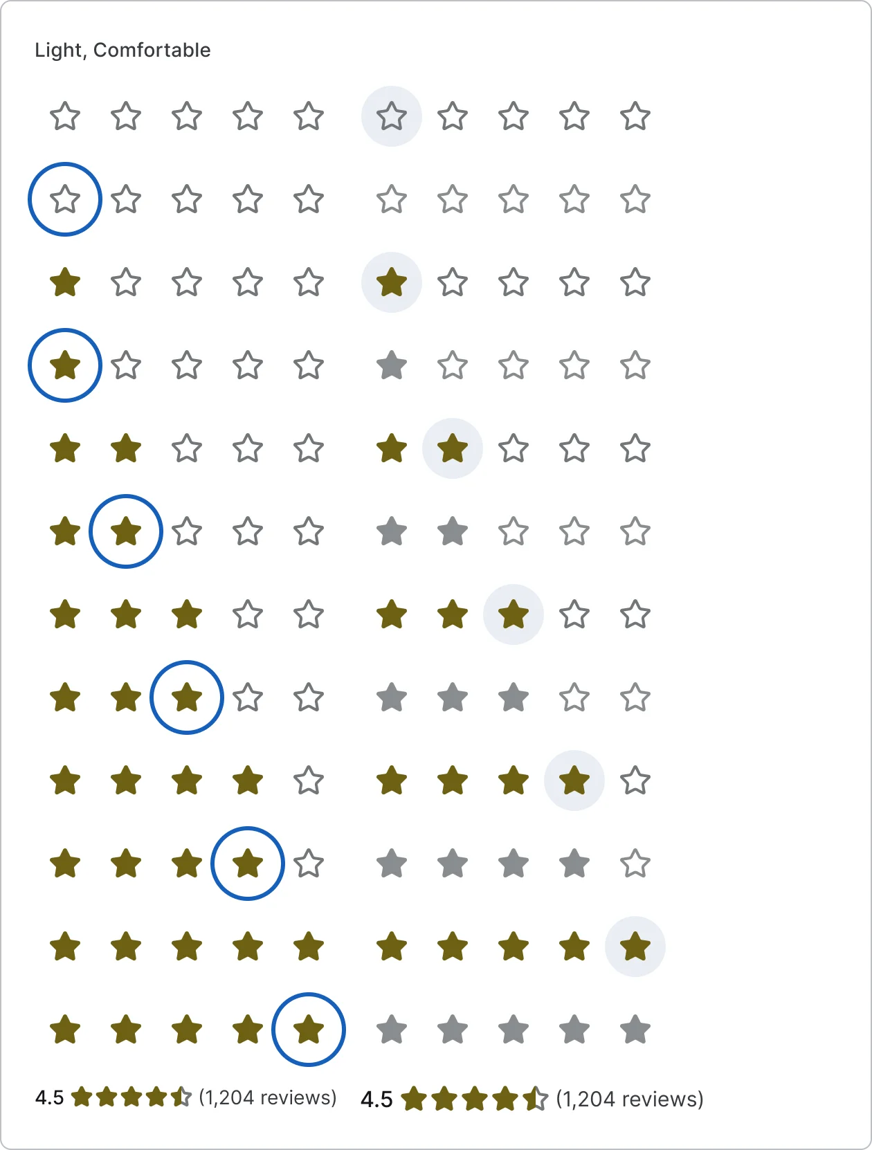
  • Star rating, every variant

    Star rating

    24 variants

    • 0
    • 1
    • 2
    • 3
    • 4
    • 5
  • Rating display

    2 variants

  • Thumbs rating, every variant

    Thumbs rating

    12 variants

    • None
    • Up
    • Down
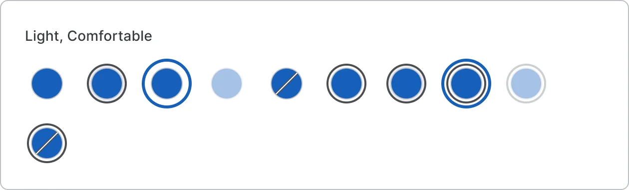
  • Colour swatch, every variant

    Colour swatch

    10 variants

    • Off
    • On
    • Default
    • Pressed
    • Focus
    • Disabled
    • Unavailable
Figma file
SuperDuper Pack: Selection controls (Mobile)
Themes
Light, Dark, Light high contrast, Dark high contrast and Wireframe
Densities
Comfortable and Compact
Also in the file
Usage and accessibility notes, motion specs, Figma variables
Covers 7 UI elements
Checkbox, Radio button, Switch, Slider, Stepper, Rating control and Colour swatches

How Airbnb, Duolingo and Revolut do it

Recreations of real products, so you can compare approaches side by side. They are approximate, built from public product knowledge, with placeholder data and no third-party artwork.
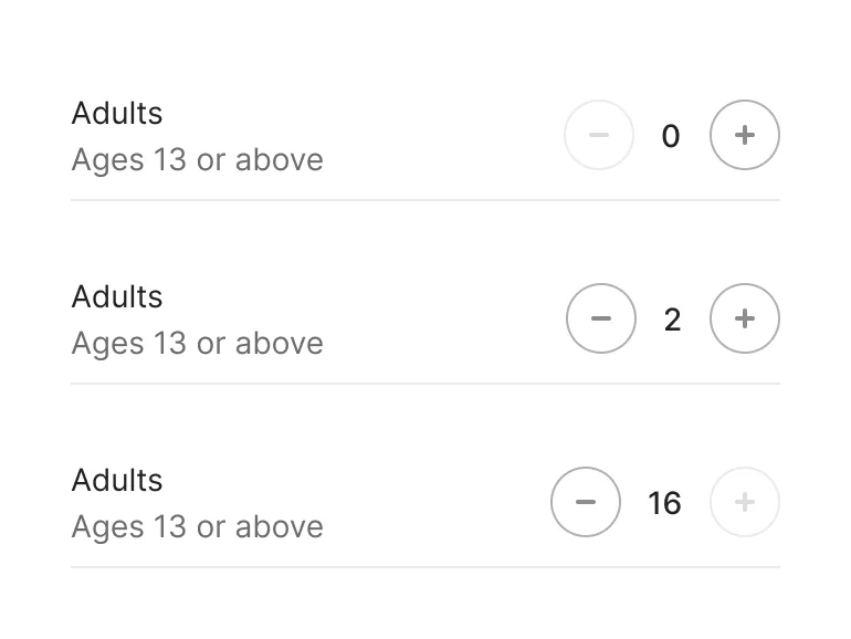
  • Guest counter, every variant

    Guest counter

    Recreated from Airbnb

  • Choice tiles, every variant

    Choice tiles

    Recreated from Duolingo

  • Fintech toggles, every variant

    Fintech toggles

    Recreated from Revolut

Not affiliated with, endorsed or sponsored by Airbnb, Duolingo and Revolut. Their names are trade marks of their owners and are used only to say what each recreation is based on.

Switch sizes, every variant

See the switch sizes full size, free

Small, medium and large switches, off and on, across six interaction states including loading. All 36 variants, free to see with a SuperDuperUI account. The Figma file comes with the pack.

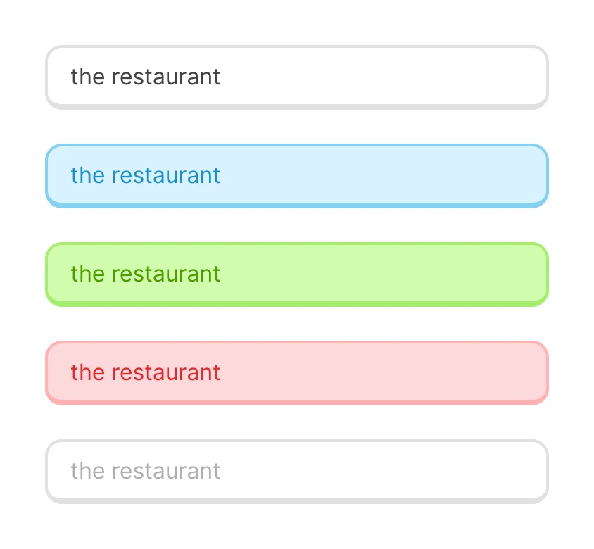
  • Form fields

    Mobile28 components208 variants5 recreations

    Mobile form fields with error and success states, each paired with the right iOS or Android keyboard.

    $9, or included with Pro
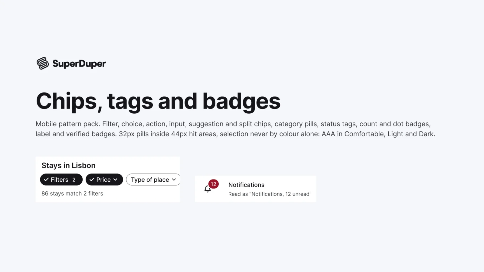
  • Chips, tags and badges

    Mobile12 components40 variants3 recreations

    Mobile chips and badges: filter, choice, input, action and category chips, plus status, count, dot and verified badges.

    $9, or included with Pro
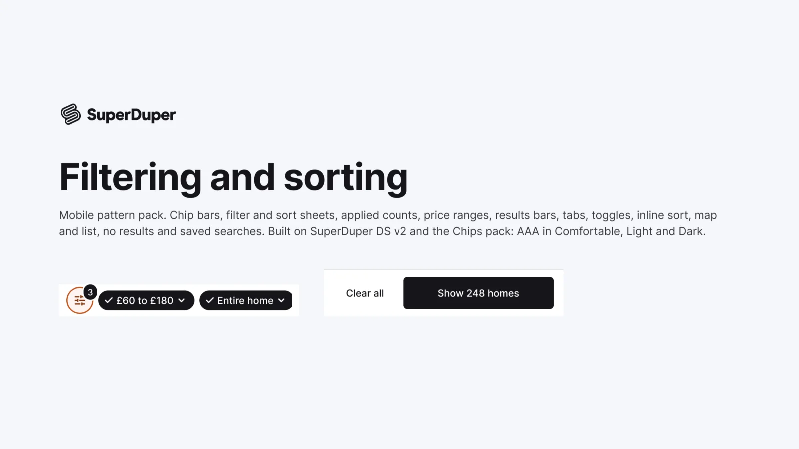
  • Filtering and sorting

    Mobile12 components41 variants5 recreations

    Mobile filter and sort patterns: chip bars, filter and sort sheets, price ranges, results bars, map and list, saved searches.

    $9, or included with Pro

Questions about the selection controls pack

  • One Figma file: SuperDuper Pack: Selection controls (Mobile). It has 19 components with 216 variants, 3 recreations, and notes on when to use each part. Everything uses Figma variables, so you can change the colours and type to match your product.