Skip to content

Tabs and segmented controls (Mobile)

Mobile packNavigation and structure

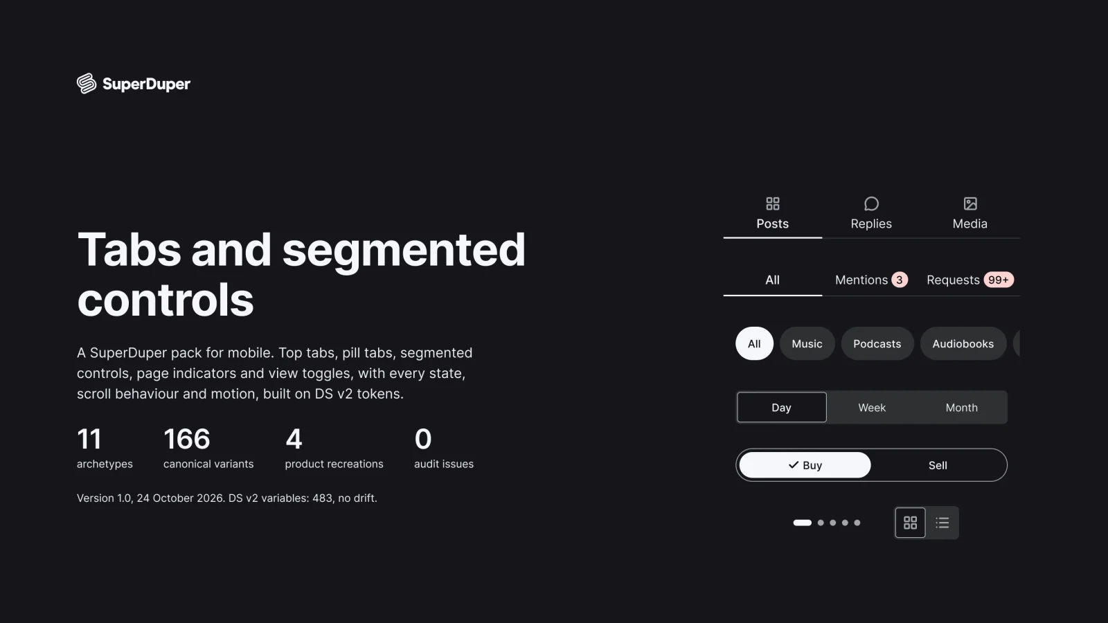
Mobile top tabs, pill tabs, segmented controls, page dots and swipe pagers, with badges, scroll states and switch motion.
components
17
variants
166
recreations
10
themes
5

Also for desktop: Tabs and segmented controls

What’s inside

Eleven tab patterns for phones: fixed and scrollable top tabs, underline and pill tabs, iOS-style and app-styled segmented controls, page indicators, grid and list toggles, tabs with counts and badges, a swipe pager and a collapsing header with tabs. Each page documents states, keyboard and screen reader behaviour and motion, with prototyped tab switches.

  • Badges and counts on every tab style
  • Scrolled, pinned and collapsed header states
  • Prototyped indicator slide, segment thumb and page dots
  • Top tab

    30 variants

    • Default
    • Hover
    • Pressed
    • Focus
    • Disabled
  • Fixed top tabs, every variant

    Fixed top tabs

    Free sample

    9 variants

    • At rest
    • Pinned
    • Collapsed
  • Scrollable top tabs, every variant

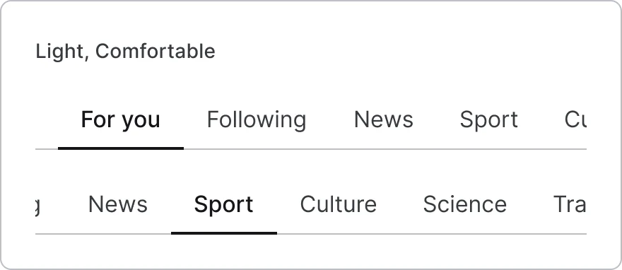
    Scrollable top tabs

    4 variants

    • At rest
    • Pinned
    • Start
    • Scrolled
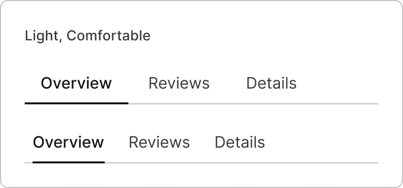
  • Underline tab, every variant

    Underline tab

    20 variants

  • Underline tabs

    4 variants

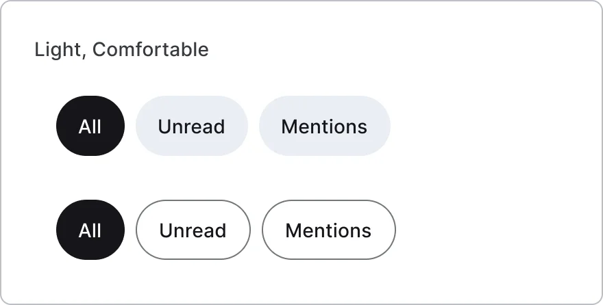
  • Pill tab, every variant

    Pill tab

    20 variants

  • Pill tabs

    4 variants

    • Fits
    • Scrolls
  • Segment

    10 variants

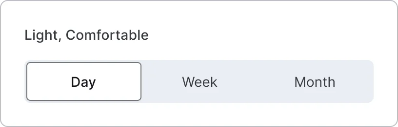
  • iOS-style segmented control, every variant

    iOS-style segmented control

    6 variants

  • App segment

    10 variants

  • App-styled segmented control, every variant

    App-styled segmented control

    4 variants

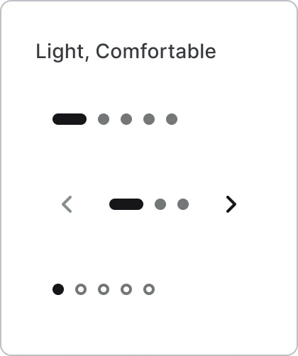
  • Page indicator, every variant

    Page indicator

    20 variants

    • Dots
    • Pill
    • Dashes
    • Counter
    • Arrows
  • View option

    10 variants

  • Grid and list toggle, every variant

    Grid and list toggle

    4 variants

  • Tabs with counts and badges, every variant

    Tabs with counts and badges

    5 variants

    • Count badge
    • Neutral count
    • Dot
    • Label
    • Loading
  • Swipe pager, every variant

    Swipe pager

    3 variants

    • Resting
    • Dragging
    • Settled
  • Collapsing header with tabs, every variant

    Collapsing header with tabs

    3 variants

    • At rest
    • Scrolled
    • Collapsed
Figma file
SuperDuper Pack: Tabs and segmented controls (Mobile)
Themes
Light, Dark, Light high contrast, Dark high contrast and Wireframe
Densities
Comfortable and Compact
Also in the file
Usage and accessibility notes, motion specs, Figma variables
Covers 3 UI elements
Top tabs, Segmented control and Page indicator

How Instagram, Revolut and Duolingo and others do it

Recreations of real products, so you can compare approaches side by side. They are approximate, built from public product knowledge, with placeholder data and no third-party artwork.
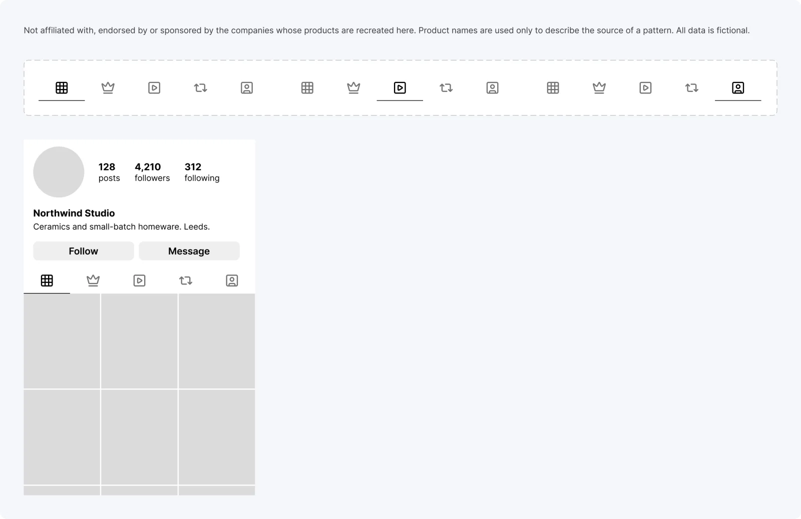
  • Icon profile tabs, every variant

    Icon profile tabs

    Recreated from Instagram

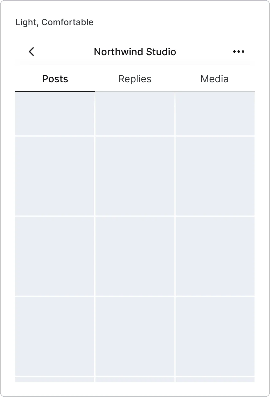
  • Photo profile in context, every variant

    Photo profile in context

    Recreated from Instagram

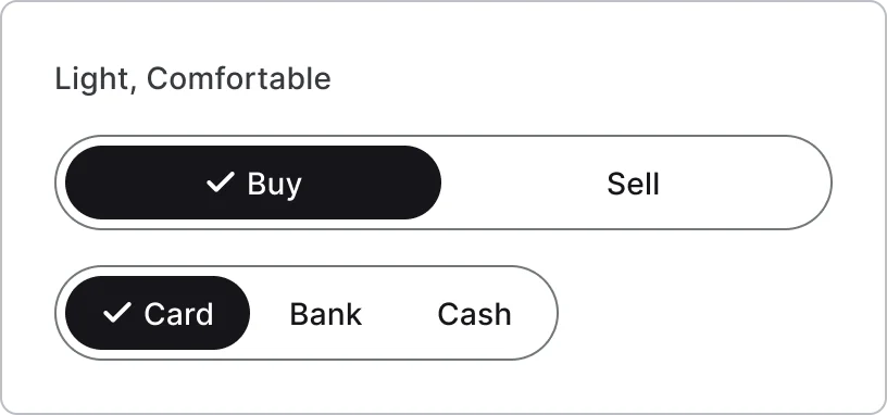
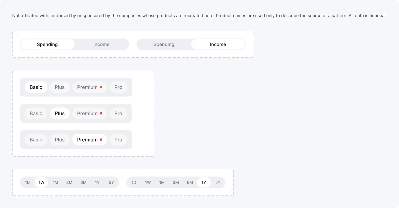
  • Two-option segmented, every variant

    Two-option segmented

    Recreated from Revolut

  • Plan pills, every variant

    Plan pills

    Recreated from Revolut

  • Chart range tabs, every variant

    Chart range tabs

    Recreated from Revolut

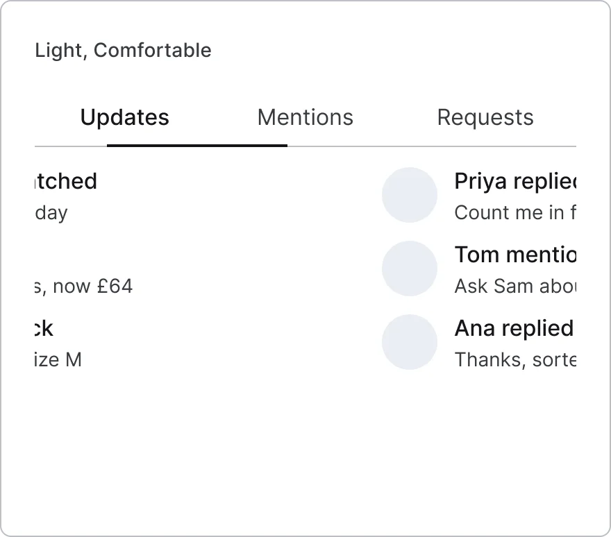
  • Two-tab header, every variant

    Two-tab header

    Recreated from Duolingo

  • Icon category tab, every variant

    Icon category tab

    Recreated from Duolingo

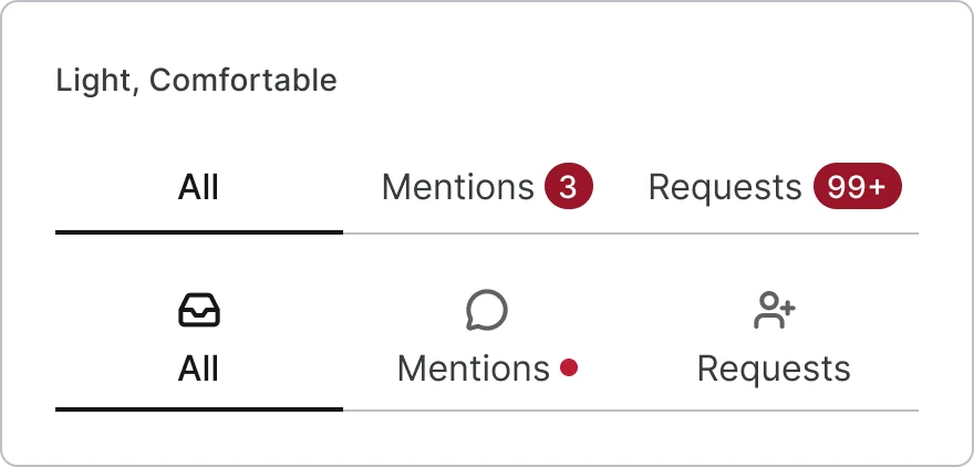
  • Profile text tabs, every variant

    Profile text tabs

    Recreated from Threads

  • Count tabs, every variant

    Count tabs

    Recreated from Threads

  • Pill tab buttons

    Recreated from Threads

Not affiliated with, endorsed or sponsored by Instagram, Revolut, Duolingo and Threads. Their names are trade marks of their owners and are used only to say what each recreation is based on.

Top tab, every variant

See the top tab full size, free

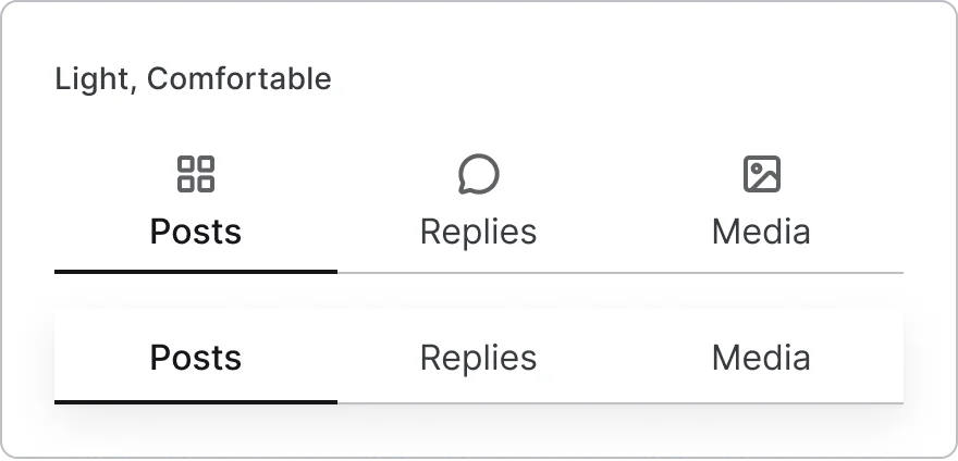
A single top tab in three layouts, selected or not, across five interaction states. All 9 variants, free to see with a SuperDuperUI account. The Figma file comes with the pack.

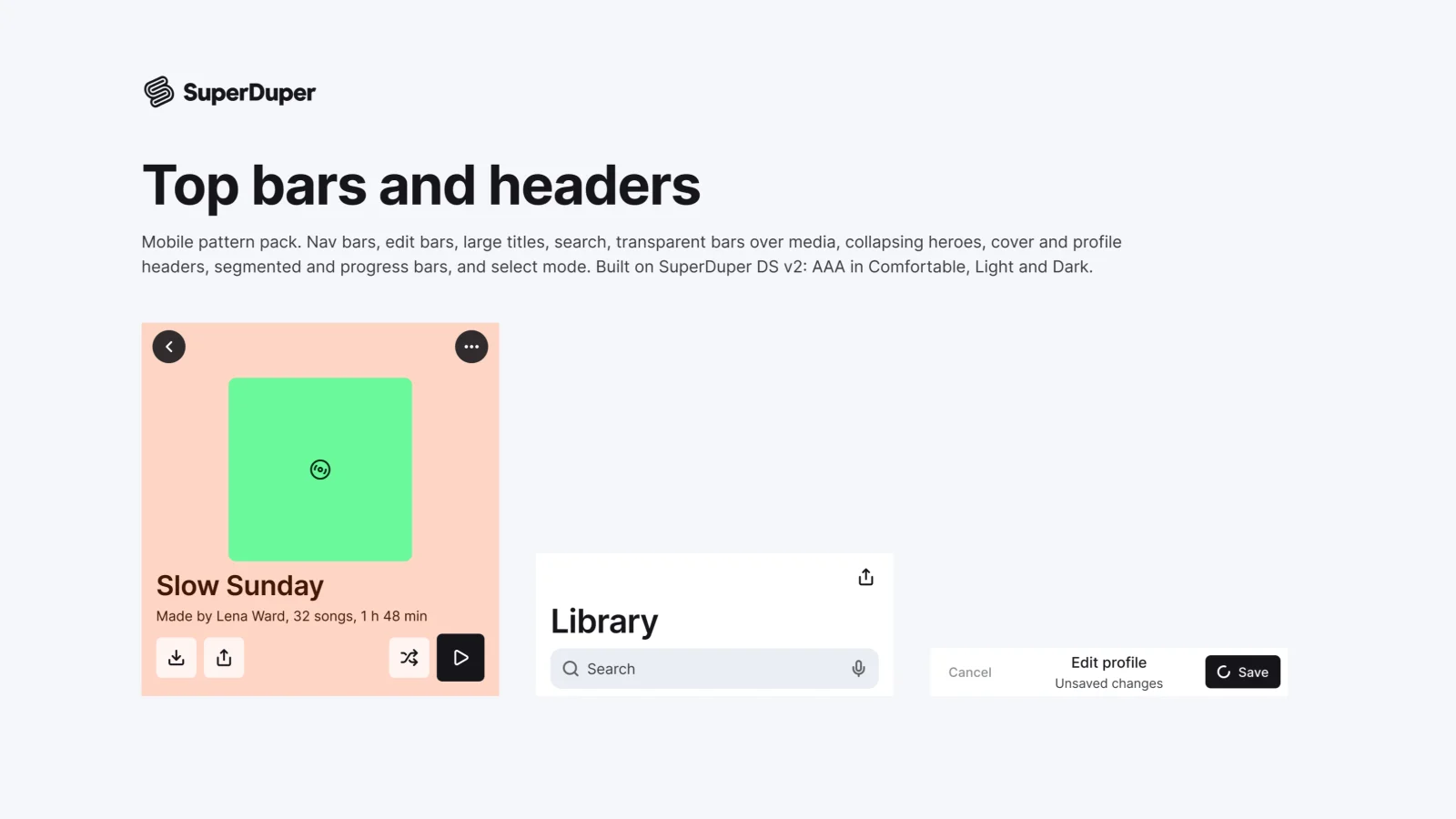
  • Top bars, headers and detail tops

    Mobile12 components47 variants3 recreations

    Mobile top bars and headers: nav bars, large titles, search, over-media, collapsing heroes, profiles, progress and selection.

    $9, or included with Pro
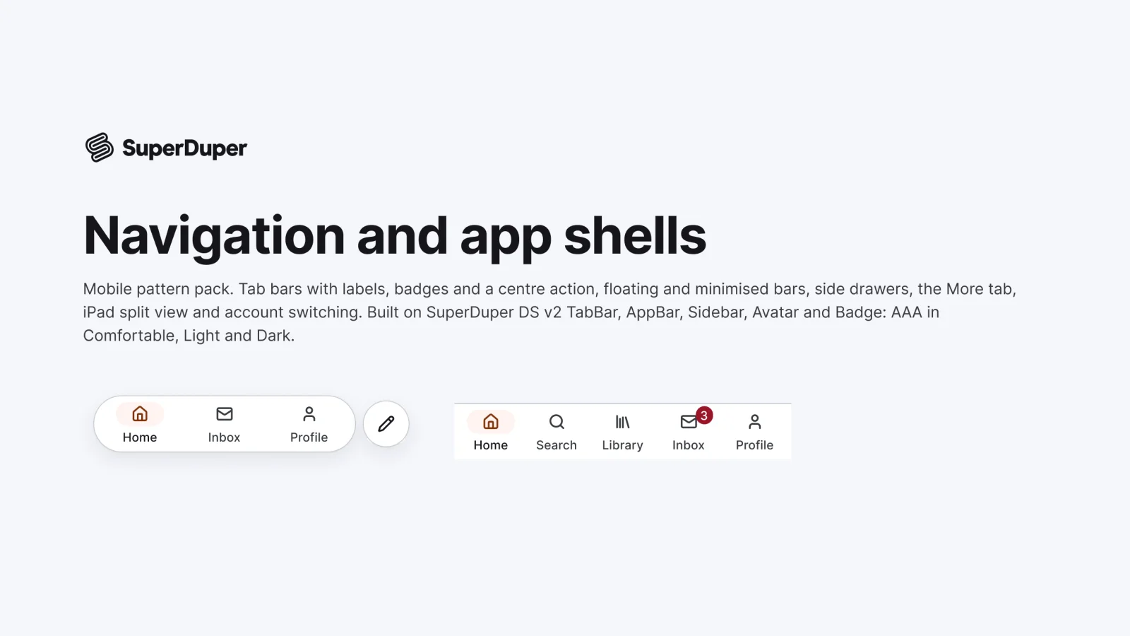
  • Navigation and app shells

    Mobile9 components34 variants3 recreations

    Mobile navigation: tab bars, centre actions, floating and minimised bars, side drawers, account switchers and iPad split view.

    $9, or included with Pro

Questions about the tabs and segmented controls pack

  • One Figma file: SuperDuper Pack: Tabs and segmented controls (Mobile). It has 17 components with 166 variants, 10 recreations, and notes on when to use each part. Everything uses Figma variables, so you can change the colours and type to match your product.