
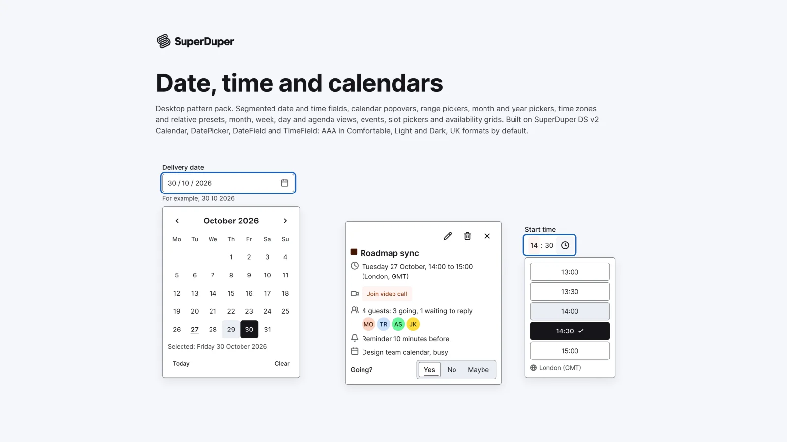
Date, time and calendars
Desktop17 components73 variants4 recreations
Desktop date and time fields, calendar and range pickers, time zones, month, week and day views, events and slot pickers.
$9, or included with Pro
Desktop packActions and input
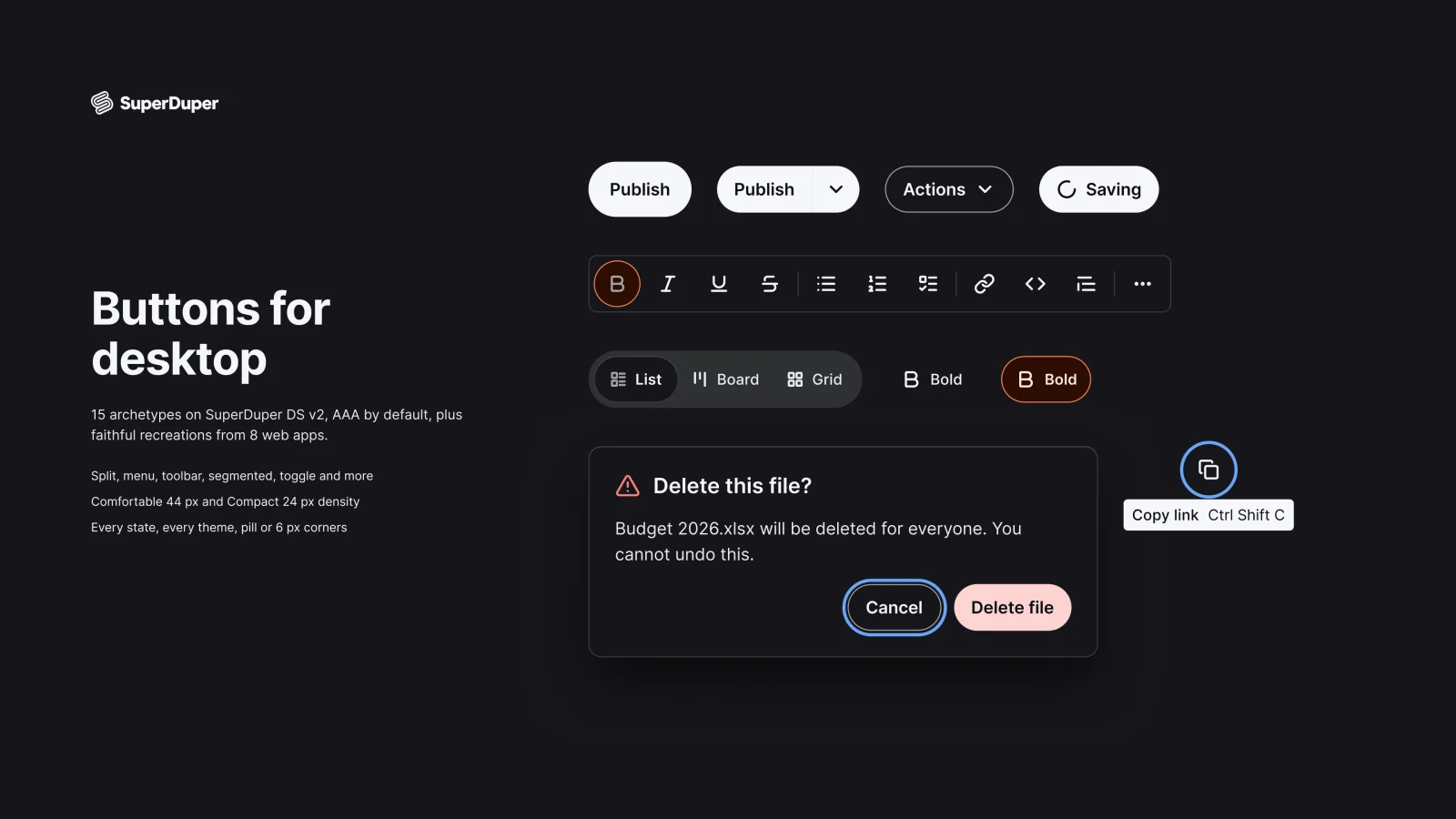
Desktop buttons in every state: primary to destructive, icon, split, menu, group, toolbar, toggle and segmented controls.
Also for mobile: Buttons and actions
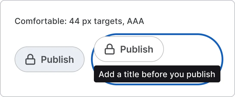
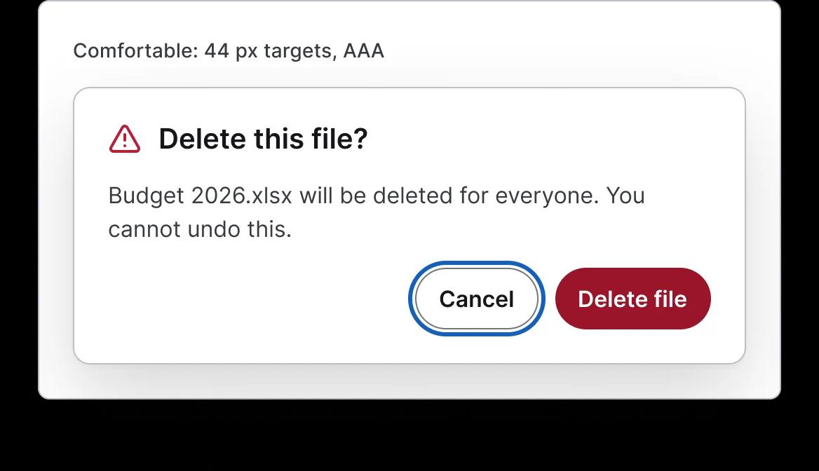
Fifteen button patterns for web apps, from primary, secondary, ghost, link, destructive and loading buttons to icon buttons with tooltips, split and menu buttons, button groups, toolbars, segmented controls, toggles, inactive buttons and destructive confirms. Every button has default, hover, pressed, focus, disabled and loading, with a documented focus ring and hover and press prototypes.
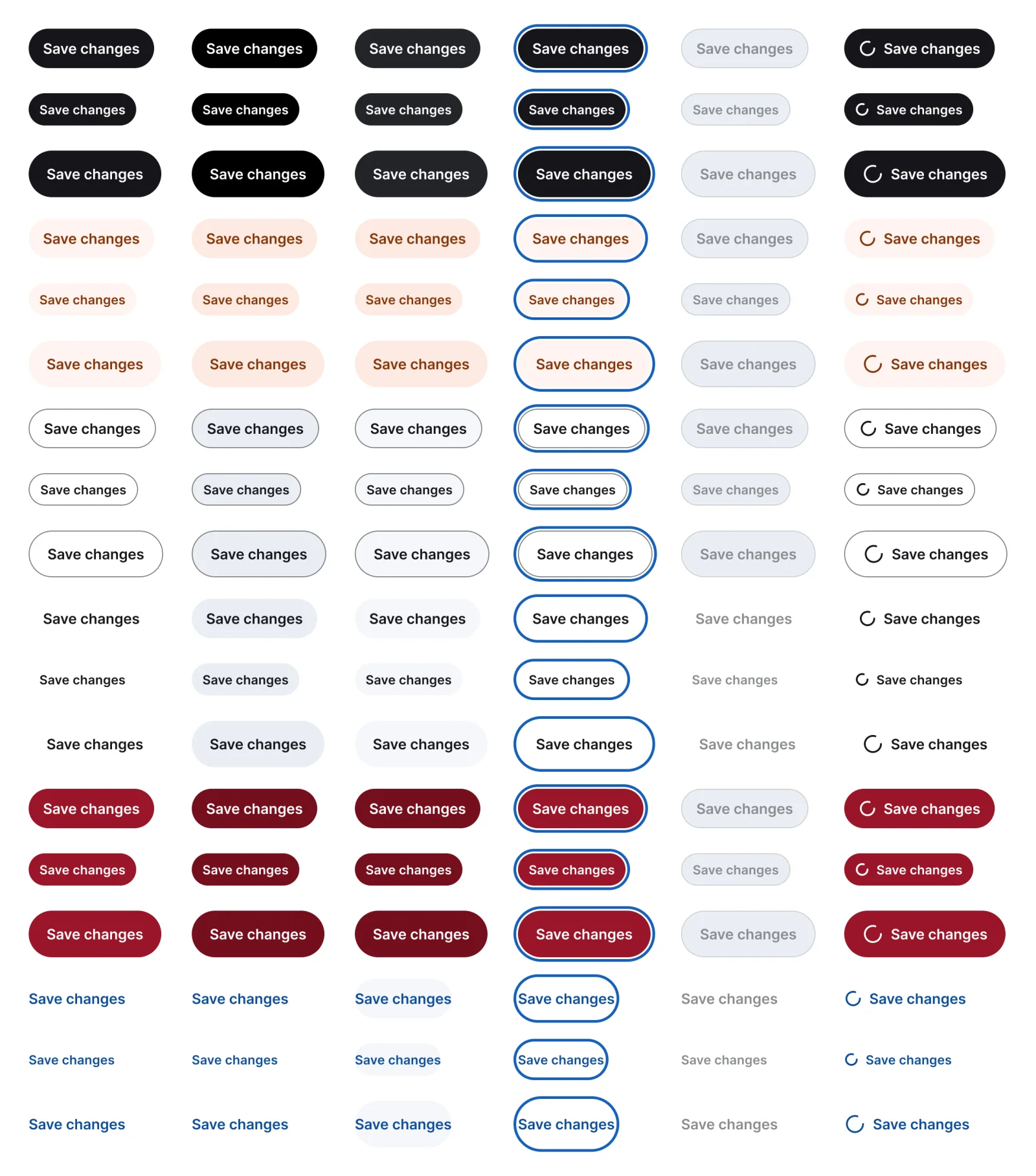
108 variants

75 variants

3 variants

16 variants
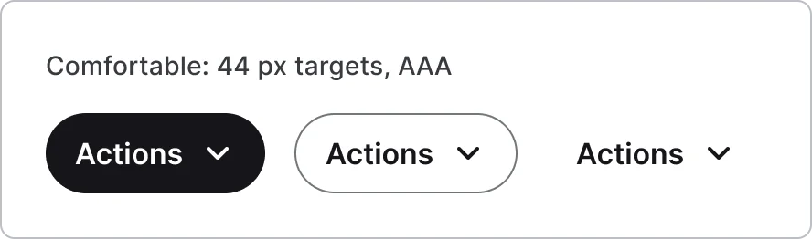
15 variants
4 variants
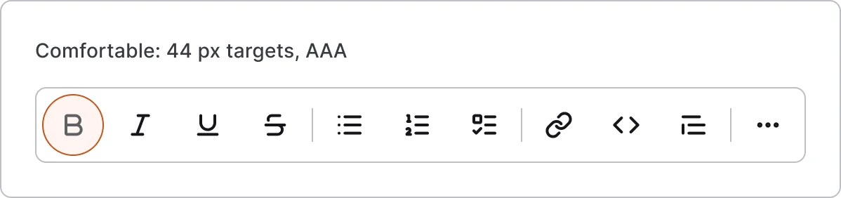
3 variants
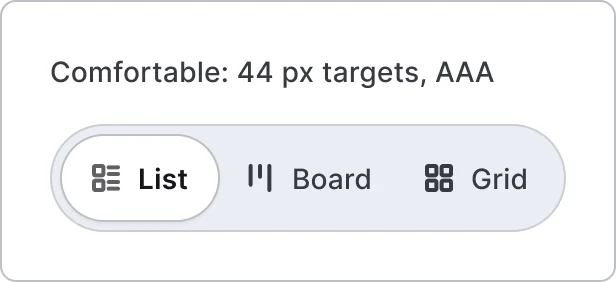
4 variants
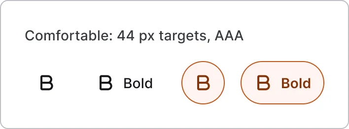
16 variants
6 variants
4 variants
Recreations of real products, so you can compare approaches side by side. They are approximate, built from public product knowledge, with placeholder data and no third-party artwork.
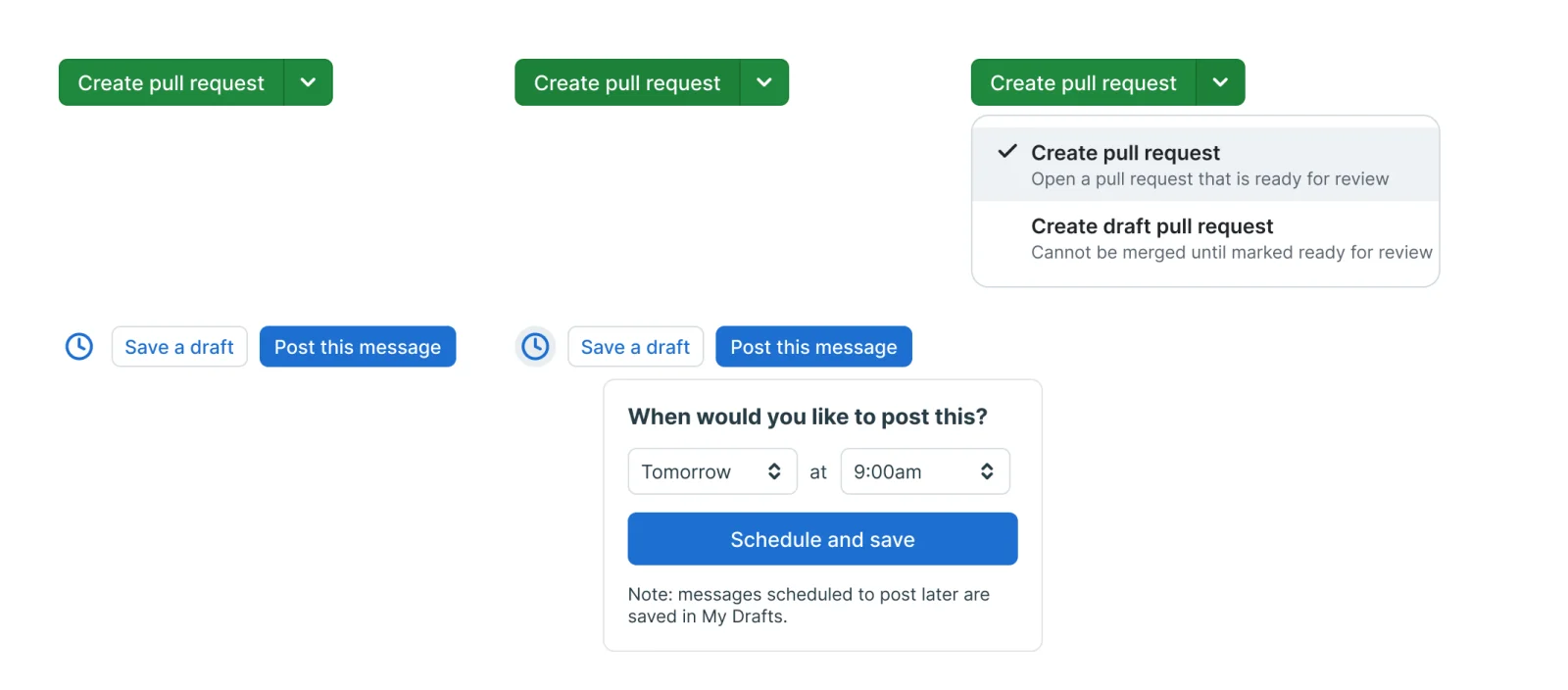
Recreated from GitHub
Recreated from Basecamp

Recreated from Replit
Recreated from Stripe Checkout

Recreated from GitHub
Recreated from Basecamp
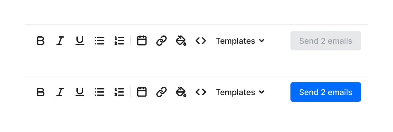
Recreated from Calendly
Recreated from Plane
Recreated from Gumloop
Recreated from AirOps
Not affiliated with, endorsed or sponsored by GitHub, Basecamp, Replit, Stripe Checkout, Calendly, Plane, Gumloop and AirOps. Their names are trade marks of their owners and are used only to say what each recreation is based on.
The core button in six styles, three sizes and six states, from default to loading. All 108 variants, free to see with a SuperDuperUI account. The Figma file comes with the pack.
Desktop17 components73 variants4 recreations
Desktop date and time fields, calendar and range pickers, time zones, month, week and day views, events and slot pickers.
$9, or included with Pro
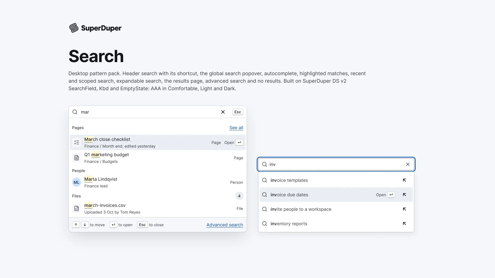
Desktop10 components34 variants4 recreations
Desktop search: header trigger, global popover, autocomplete, match highlights, recents, scoped search, results and no results.
$9, or included with Pro
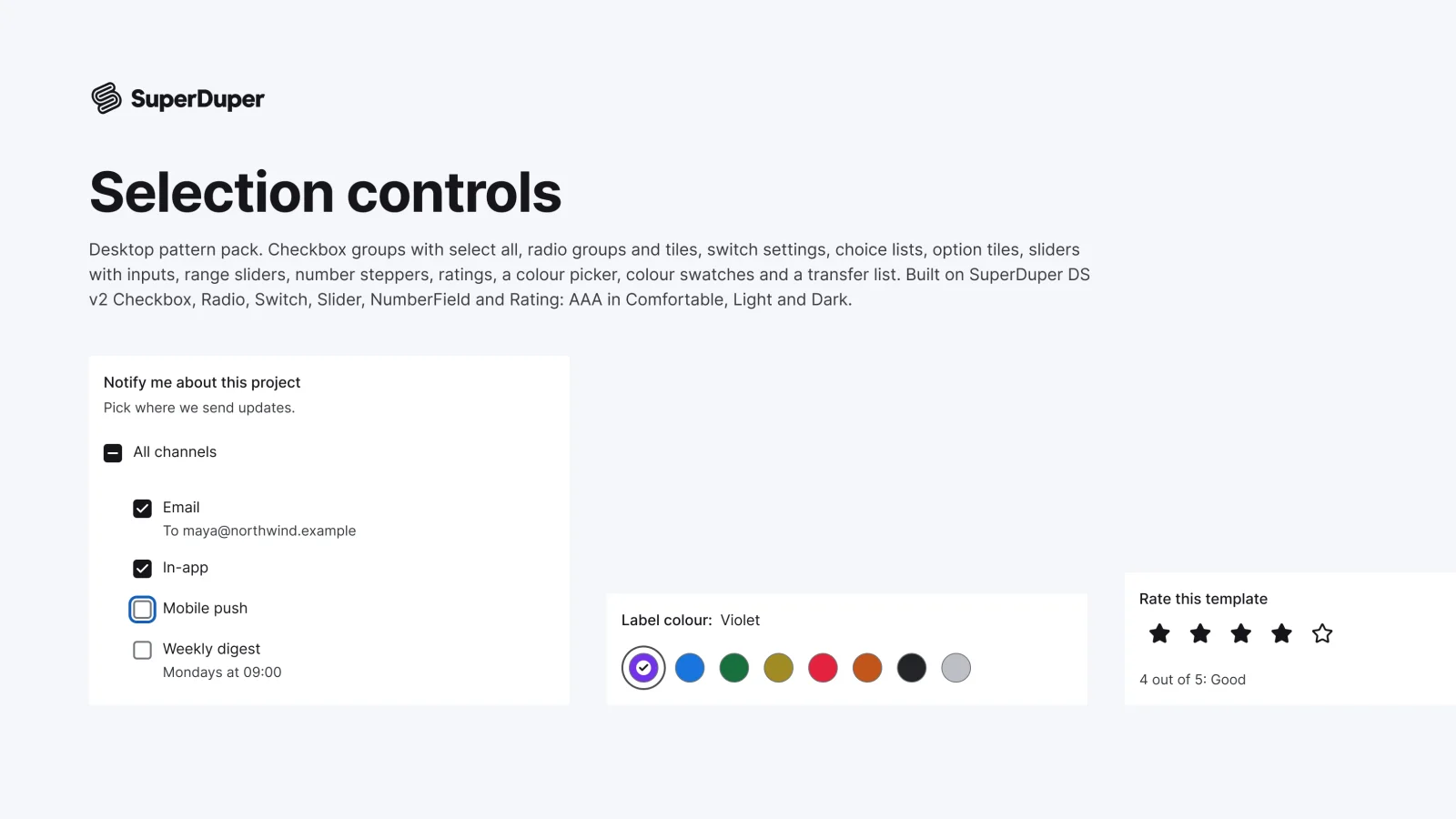
Desktop13 components54 variants3 recreations
Desktop checkbox and radio groups, setting switches, sliders, steppers, ratings, swatches, a colour picker and a transfer list.
$9, or included with Pro
One Figma file: SuperDuper Pack: Buttons (Desktop). It has 11 components with 254 variants, 10 recreations, and notes on when to use each part. Everything uses Figma variables, so you can change the colours and type to match your product.