Skip to content

Buttons and actions (Mobile)

Mobile packActions and input

16 kinds of mobile button found in 20 real iOS apps, rebuilt as editable components with every state.
components
16
variants
1,212
themes
2

Also for desktop: Buttons and actions

What’s inside

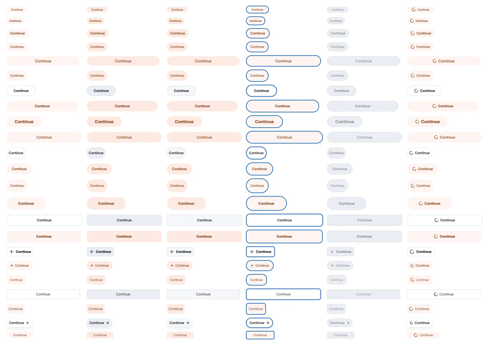
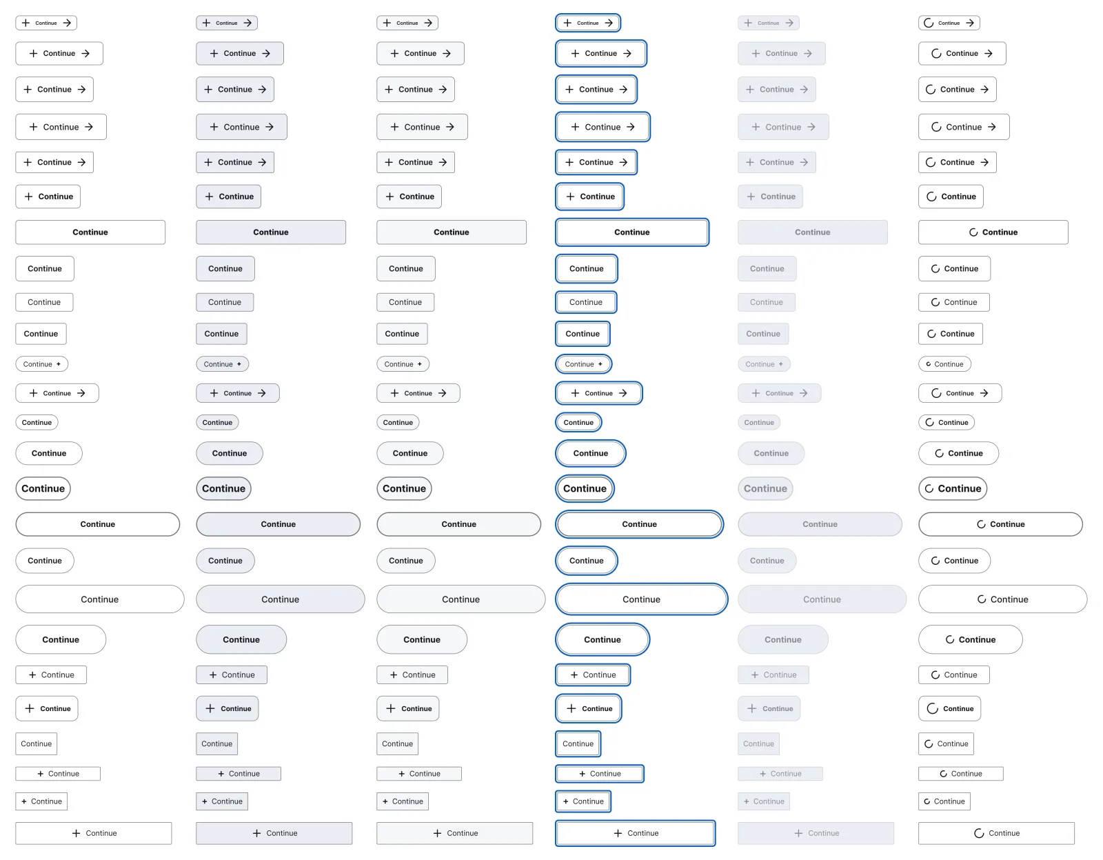
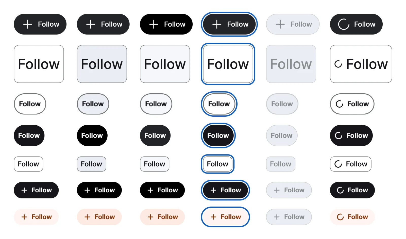
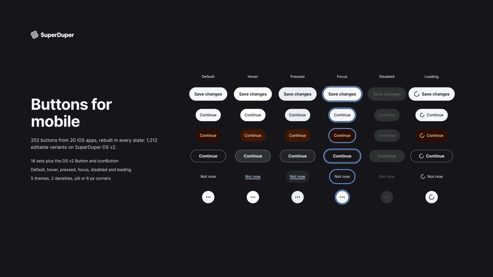
Filled, tonal, outline, text, on media, toggle, raised, edge to edge, sign in and pay buttons, three icon button shapes, floating, play and pause, and icon over label. Every set has default, hover, pressed, focus, disabled and loading states, with hover and press prototype reactions. Corners default to pills with a 6px option, and every colour follows the light and dark themes.
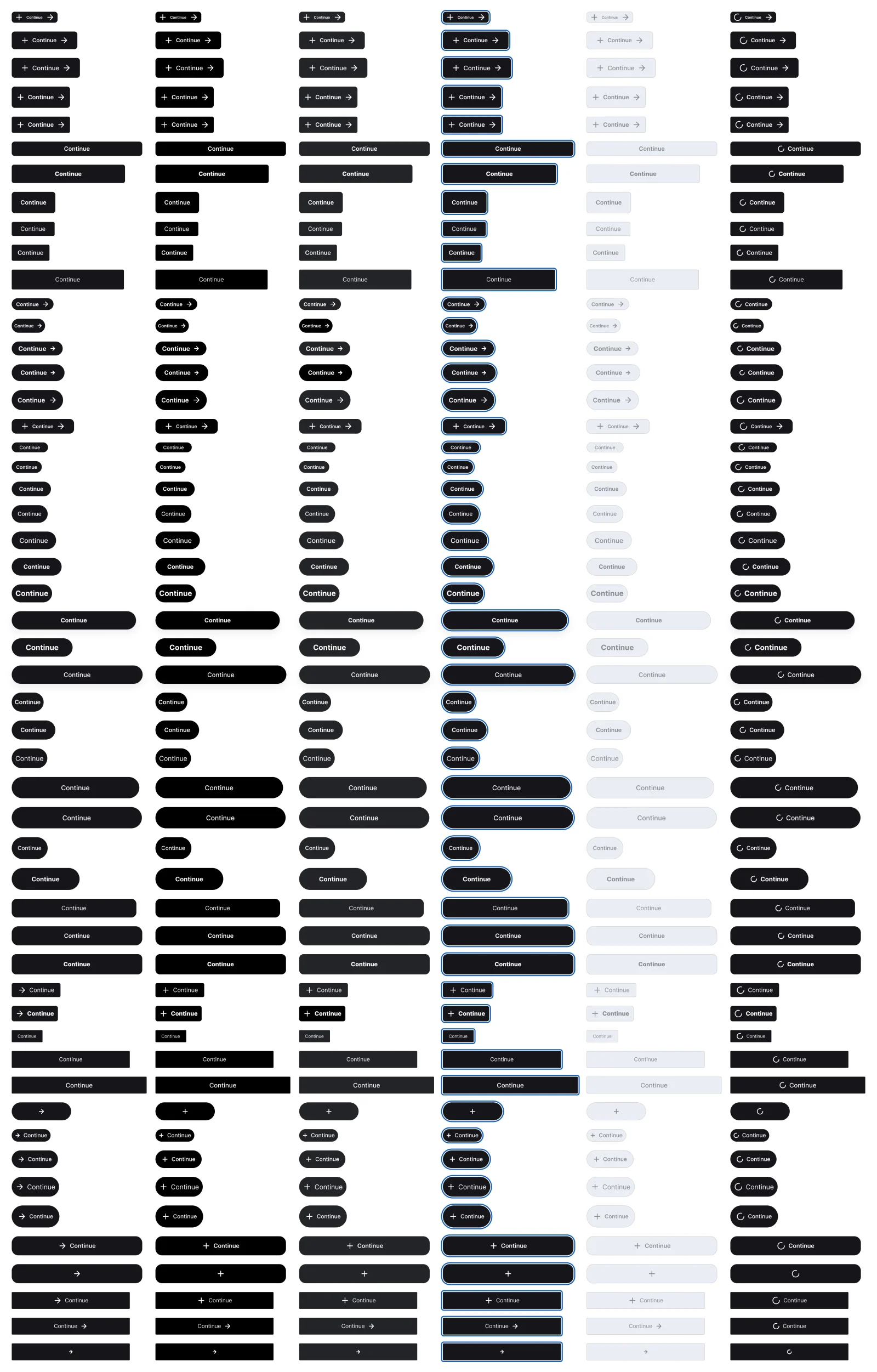
  • Default, hover, pressed, focus, disabled and loading on every set
  • Pill corners by default, 6px corners as an option
  • Hover and press prototype reactions on every default button
  • Measured from 202 distinct buttons in 20 iOS apps
  • Filled button, every variant

    Filled button

    Free sample

    312 variants

    • Default
    • Hover
    • Pressed
    • Focus
    • Disabled
    • Loading
  • Tonal button, every variant

    Tonal button

    138 variants

    • Default
    • Hover
    • Pressed
    • Focus
    • Disabled
    • Loading
  • Outline button, every variant

    Outline button

    150 variants

    • Default
    • Hover
    • Pressed
    • Focus
    • Disabled
    • Loading
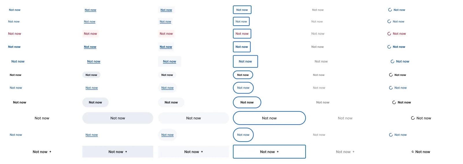
  • Text button, every variant

    Text button

    66 variants

    • Default
    • Hover
    • Pressed
    • Focus
    • Disabled
    • Loading
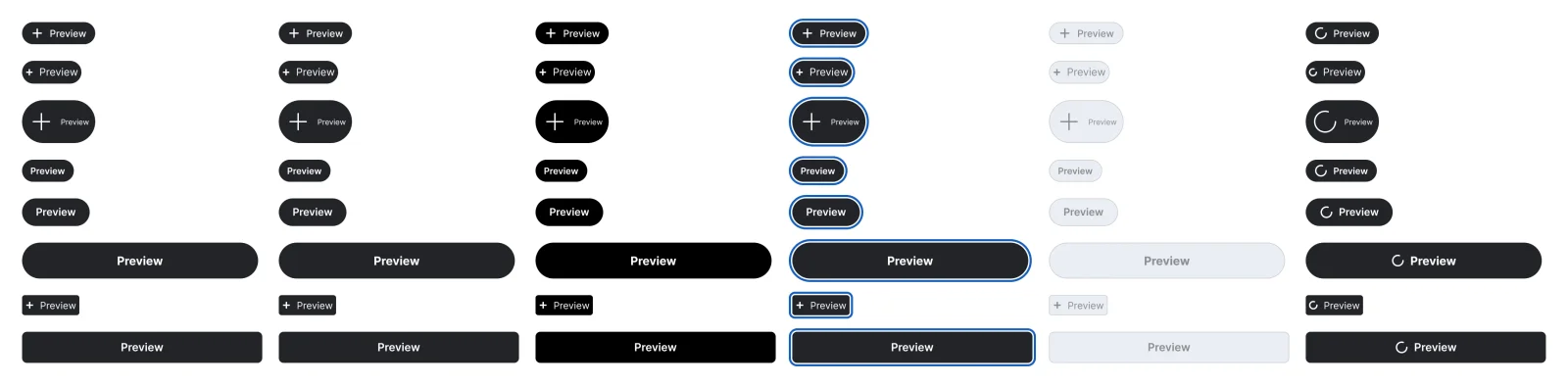
  • On media button, every variant

    On media button

    48 variants

    • Default
    • Hover
    • Pressed
    • Focus
    • Disabled
    • Loading
  • Toggle button, every variant

    Toggle button

    42 variants

    • Default
    • Hover
    • Pressed
    • Focus
    • Disabled
    • Loading
  • Raised button, every variant

    Raised button

    30 variants

    • Default
    • Hover
    • Pressed
    • Focus
    • Disabled
    • Loading
  • Edge to edge button, every variant

    Edge to edge button

    30 variants

    • Default
    • Hover
    • Pressed
    • Focus
    • Disabled
    • Loading
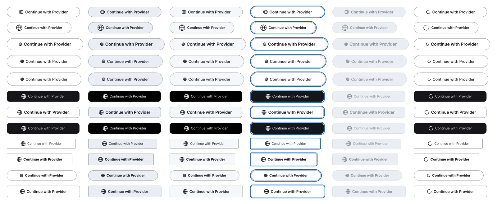
  • Sign in with provider, every variant

    Sign in with provider

    72 variants

    • Default
    • Hover
    • Pressed
    • Focus
    • Disabled
    • Loading
  • Pay with provider, every variant

    Pay with provider

    18 variants

    • Default
    • Hover
    • Pressed
    • Focus
    • Disabled
    • Loading
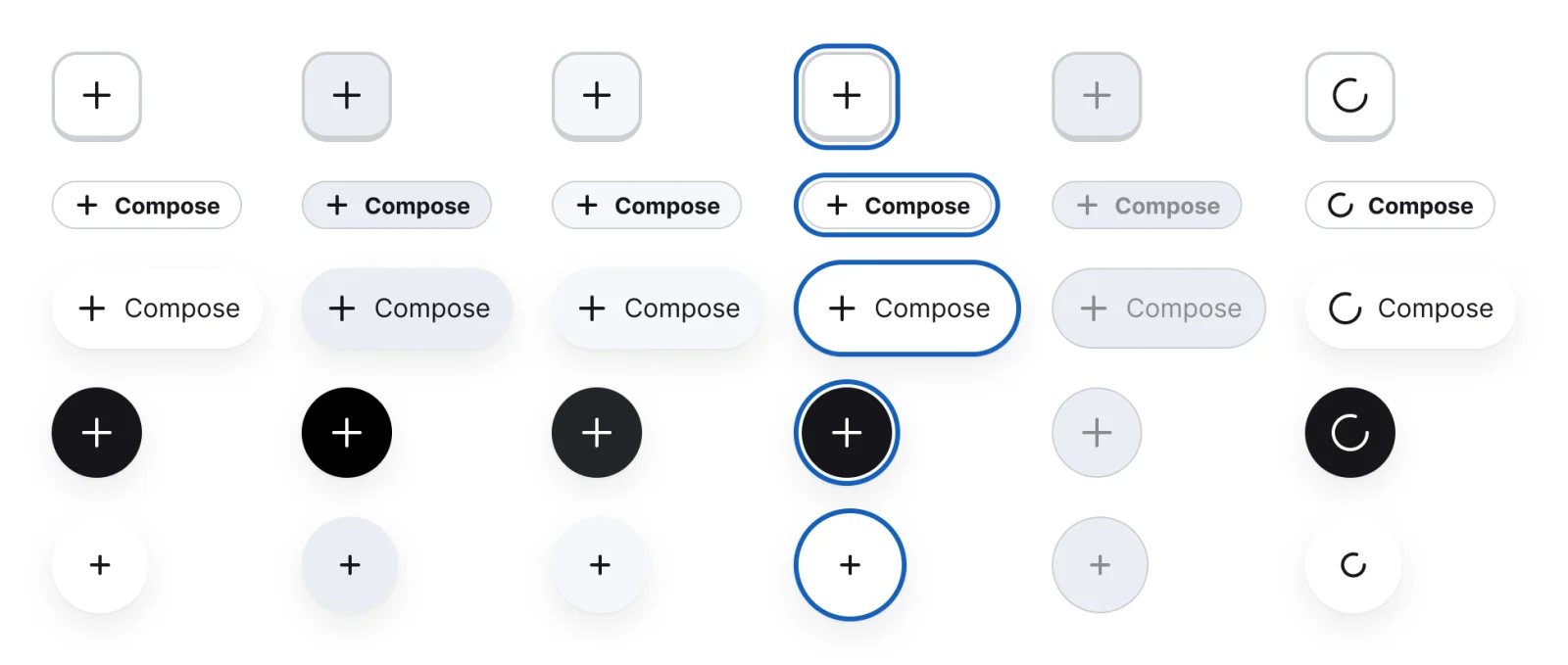
  • Circle icon button, every variant

    Circle icon button

    102 variants

    • Default
    • Hover
    • Pressed
    • Focus
    • Disabled
    • Loading
  • Rounded square icon button, every variant

    Rounded square icon button

    54 variants

    • Default
    • Hover
    • Pressed
    • Focus
    • Disabled
    • Loading
  • Plain icon button, every variant

    Plain icon button

    36 variants

    • Default
    • Hover
    • Pressed
    • Focus
    • Disabled
    • Loading
  • Floating action button, every variant

    Floating action button

    30 variants

    • Default
    • Hover
    • Pressed
    • Focus
    • Disabled
    • Loading
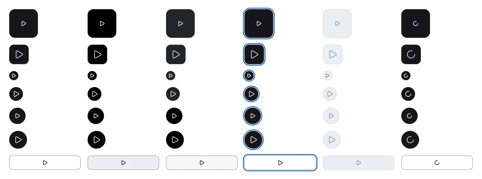
  • Play and pause button, every variant

    Play and pause button

    42 variants

    • Default
    • Hover
    • Pressed
    • Focus
    • Disabled
    • Loading
  • Icon over label button, every variant

    Icon over label button

    42 variants

    • Default
    • Hover
    • Pressed
    • Focus
    • Disabled
    • Loading
Figma file
SuperDuper Pack: Buttons (Mobile)
Themes
Light and Dark
Also in the file
Usage and accessibility notes, motion specs, Figma variables
Covers 5 UI elements
Button, Icon button, Text link, Floating action button and Social login button
Filled button, every variant

See the filled button full size, free

The solid, high emphasis call to action in every size, shape and state. All 312 variants, free to see with a SuperDuperUI account. The Figma file comes with the pack.

  • Form fields

    Mobile28 components208 variants5 recreations

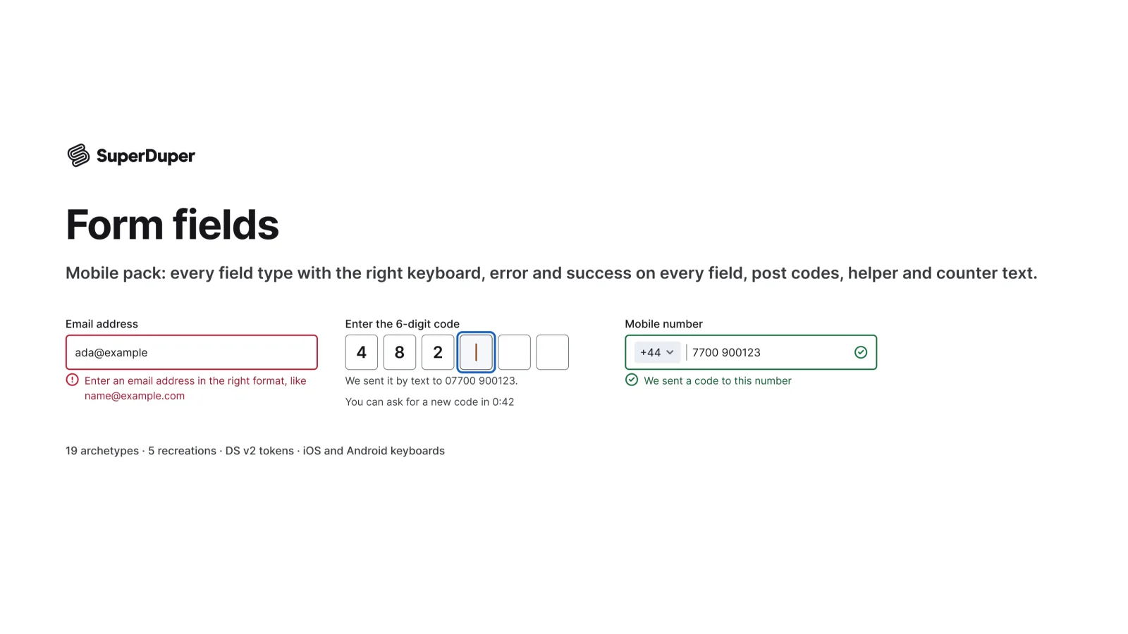
    Mobile form fields with error and success states, each paired with the right iOS or Android keyboard.

    $9, or included with Pro
  • Selection controls

    Mobile19 components216 variants3 recreations

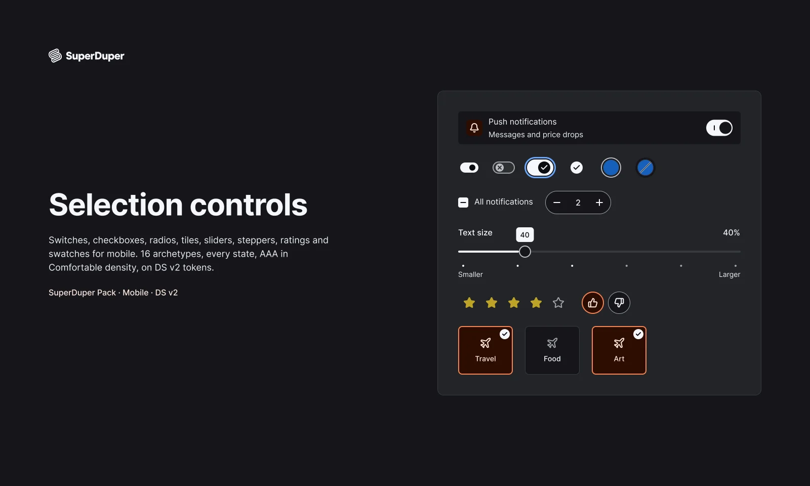
    Mobile switches, checkboxes, radios, sliders, steppers, ratings and swatches, each with every state drawn and documented.

    $9, or included with Pro
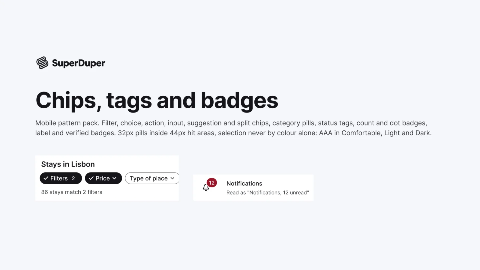
  • Chips, tags and badges

    Mobile12 components40 variants3 recreations

    Mobile chips and badges: filter, choice, input, action and category chips, plus status, count, dot and verified badges.

    $9, or included with Pro

Questions about the buttons and actions pack

  • One Figma file: SuperDuper Pack: Buttons (Mobile). It has 16 components with 1212 variants, and notes on when to use each part. Everything uses Figma variables, so you can change the colours and type to match your product.