Skip to content

Form fields (Desktop)

Desktop packActions and input

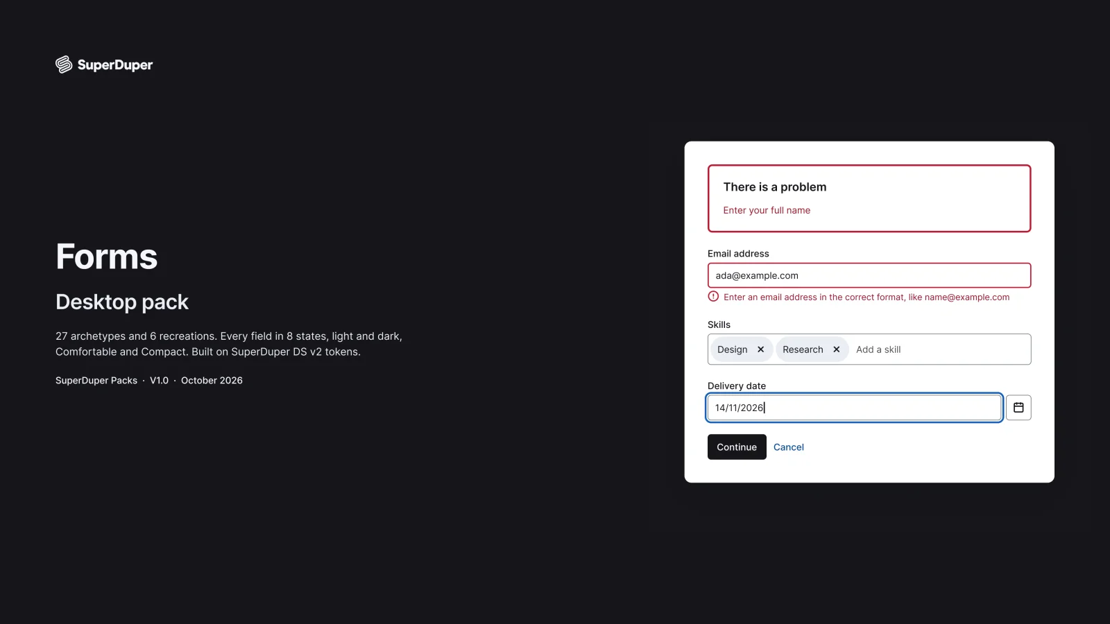
Desktop form fields and layouts: 20 field types in 8 states each, plus validation, error summary, save bar and multi-step forms.
components
30
variants
359
recreations
6
themes
5

Also for mobile: Form fields

What’s inside

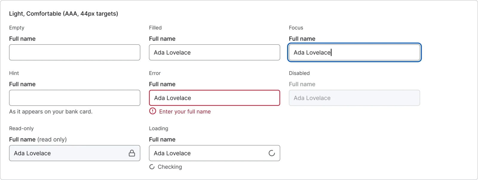
20 desktop field patterns plus radio cards, from text, email and postcode to date pickers, combobox, multi-select, file upload, password, one-time code and range slider. Every field has 8 states, including hint, error, read-only and loading, with a visible or hidden label. Form patterns cover validation timing, error summary, one and two column layouts, sections, a save bar and a check your answers flow.
  • Error summary that links to each field with an error
  • Save bar, sections and a 4-step flow with check your answers
  • 6 recreations of payment, settings, government and docs forms
  • Text field, every variant

    Text field

    Free sample

    16 variants

    • Empty
    • Filled
    • Focus
    • Hint
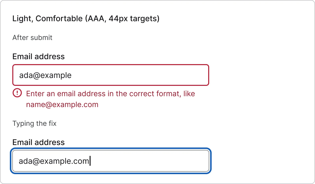
    • Error
    • Disabled
    • Read-only
    • Loading
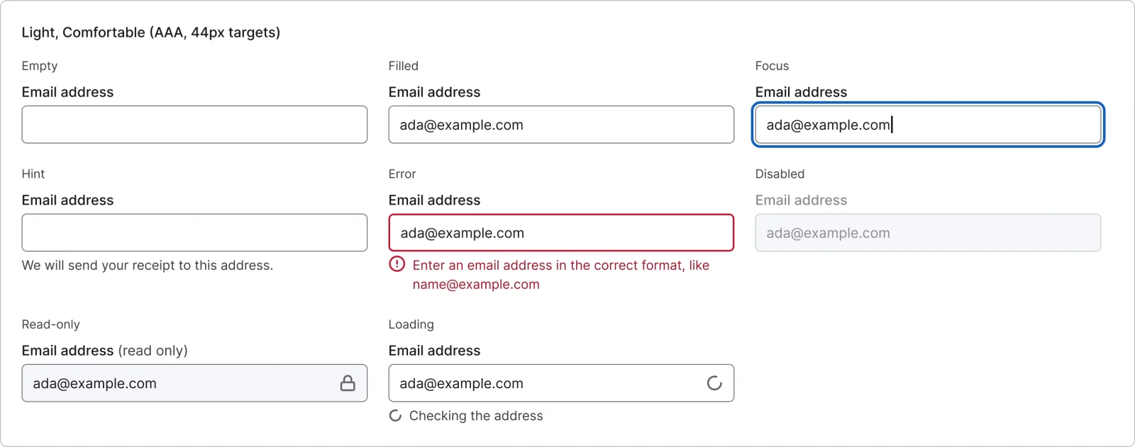
  • Email field, every variant

    Email field

    16 variants

    • Empty
    • Filled
    • Focus
    • Hint
    • Error
    • Disabled
    • Read-only
    • Loading
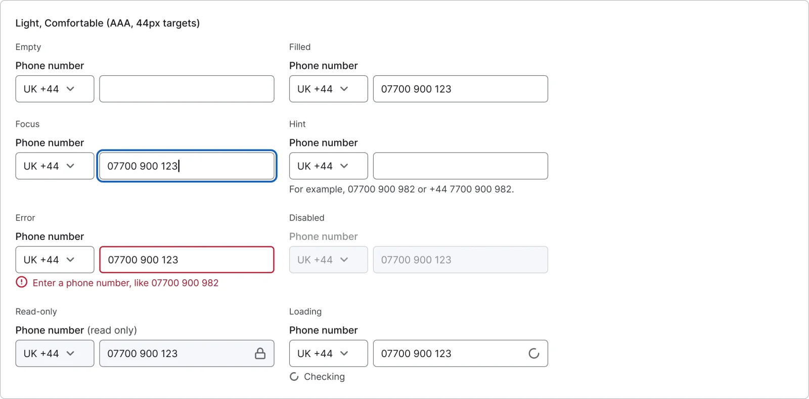
  • Phone field, every variant

    Phone field

    16 variants

    • Empty
    • Filled
    • Focus
    • Hint
    • Error
    • Disabled
    • Read-only
    • Loading
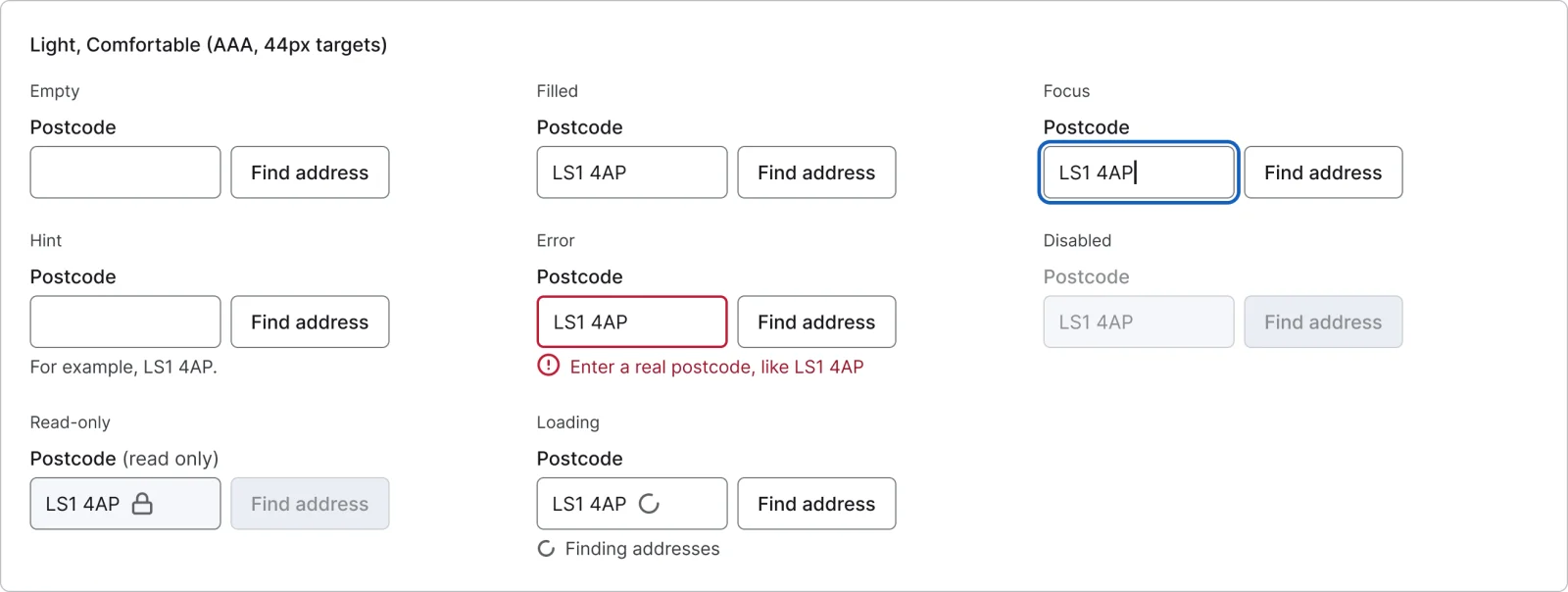
  • Postcode field, every variant

    Postcode field

    16 variants

    • Empty
    • Filled
    • Focus
    • Hint
    • Error
    • Disabled
    • Read-only
    • Loading
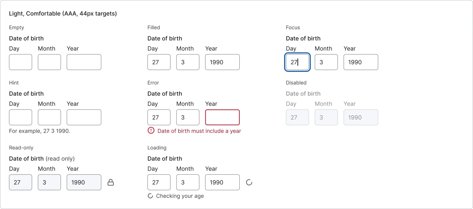
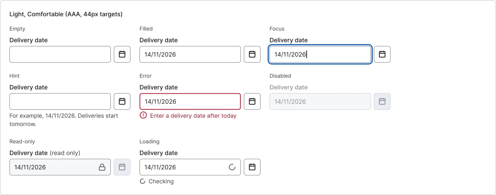
  • Date of birth, every variant

    Date of birth

    16 variants

    • Empty
    • Filled
    • Focus
    • Hint
    • Error
    • Disabled
    • Read-only
    • Loading
  • Date picker, every variant

    Date picker

    16 variants

    • Empty
    • Filled
    • Focus
    • Hint
    • Error
    • Disabled
    • Read-only
    • Loading
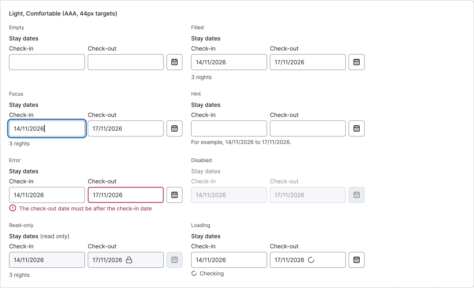
  • Date range, every variant

    Date range

    16 variants

    • Empty
    • Filled
    • Focus
    • Hint
    • Error
    • Disabled
    • Read-only
    • Loading
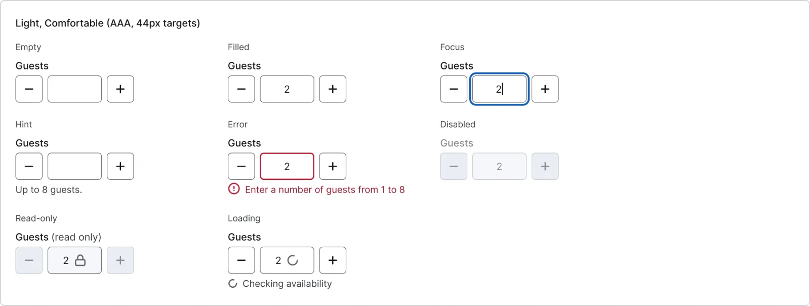
  • Number stepper, every variant

    Number stepper

    16 variants

    • Empty
    • Filled
    • Focus
    • Hint
    • Error
    • Disabled
    • Read-only
    • Loading
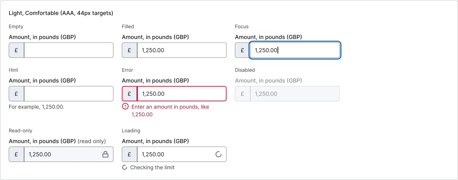
  • Currency field, every variant

    Currency field

    16 variants

    • Empty
    • Filled
    • Focus
    • Hint
    • Error
    • Disabled
    • Read-only
    • Loading
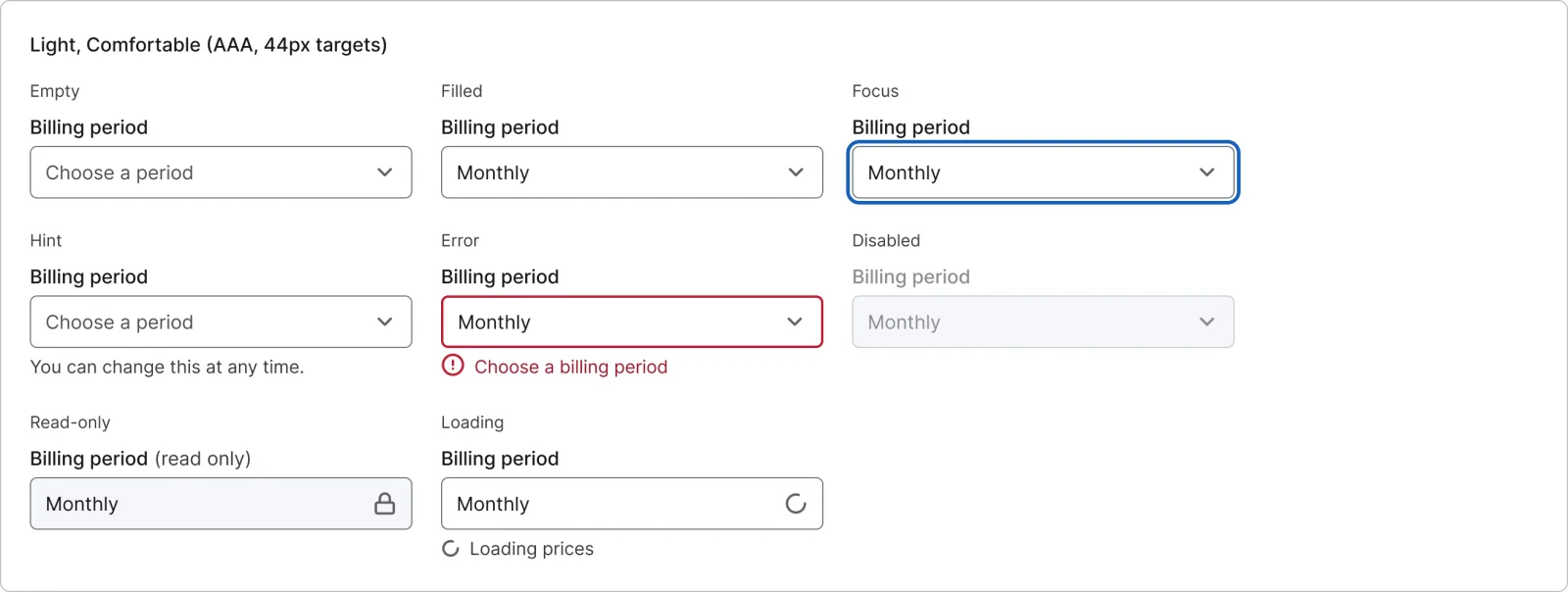
  • Select, every variant

    Select

    16 variants

    • Empty
    • Filled
    • Focus
    • Hint
    • Error
    • Disabled
    • Read-only
    • Loading
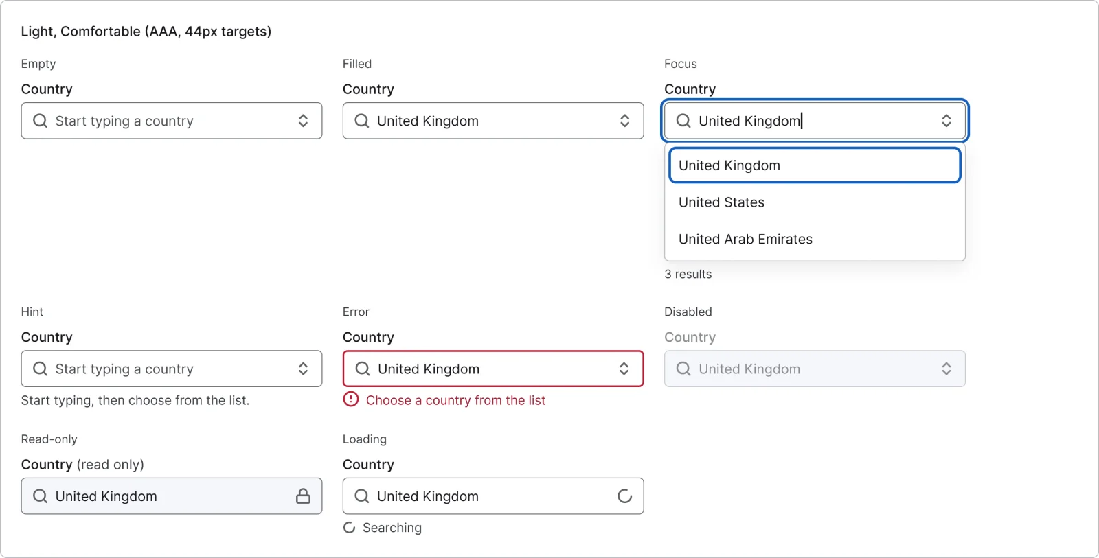
  • Combobox, every variant

    Combobox

    16 variants

    • Empty
    • Filled
    • Focus
    • Hint
    • Error
    • Disabled
    • Read-only
    • Loading
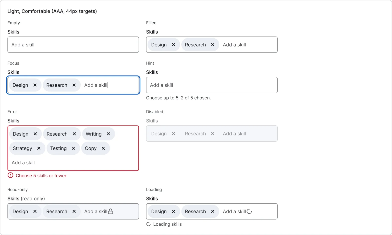
  • Multi-select, every variant

    Multi-select

    16 variants

    • Empty
    • Filled
    • Focus
    • Hint
    • Error
    • Disabled
    • Read-only
    • Loading
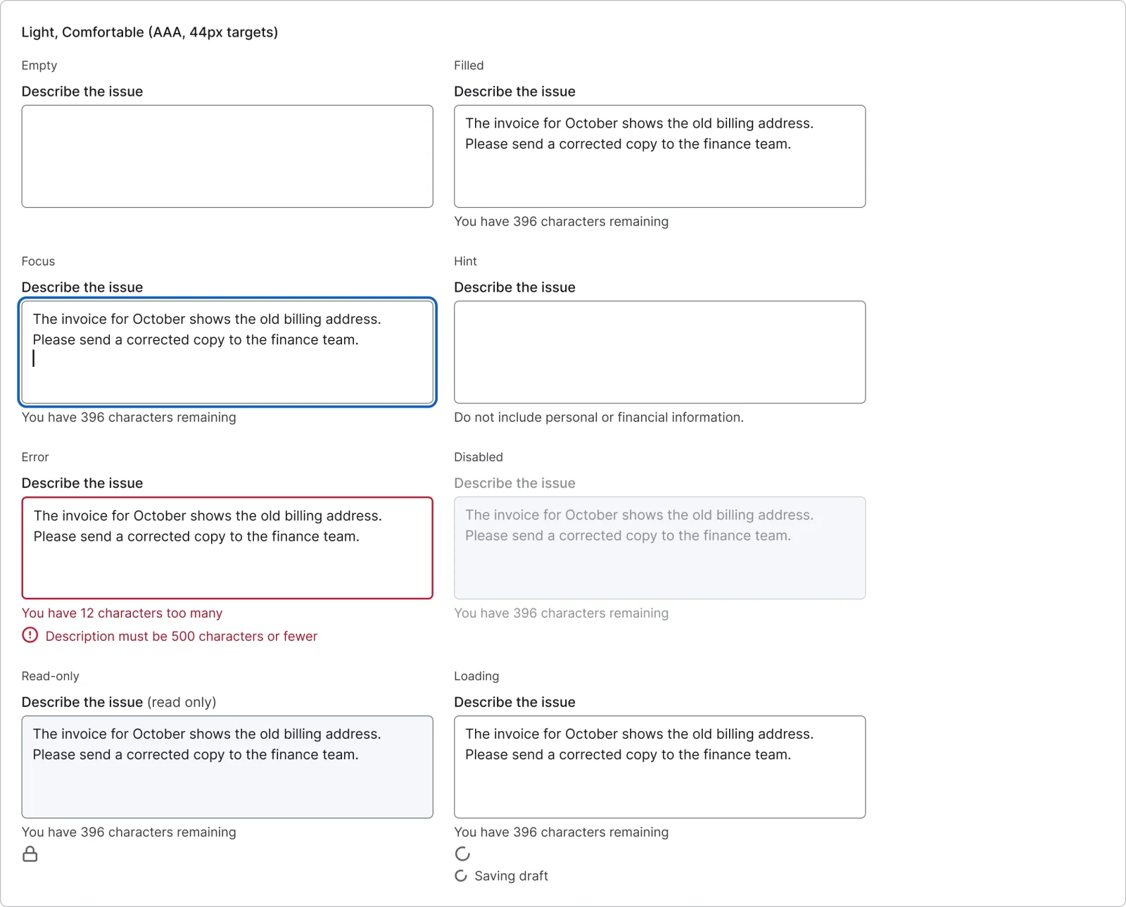
  • Text area, every variant

    Text area

    16 variants

    • Empty
    • Filled
    • Focus
    • Hint
    • Error
    • Disabled
    • Read-only
    • Loading
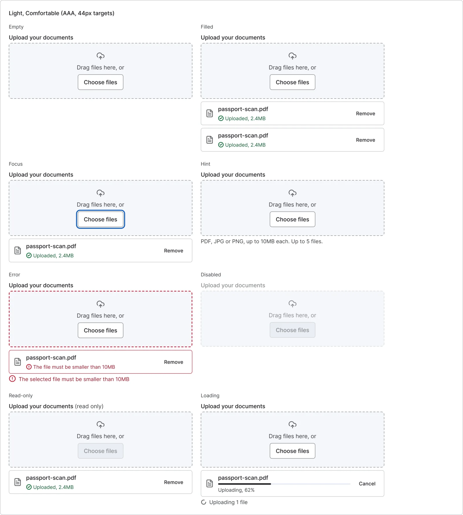
  • File upload, every variant

    File upload

    16 variants

    • Empty
    • Filled
    • Focus
    • Hint
    • Error
    • Disabled
    • Read-only
    • Loading
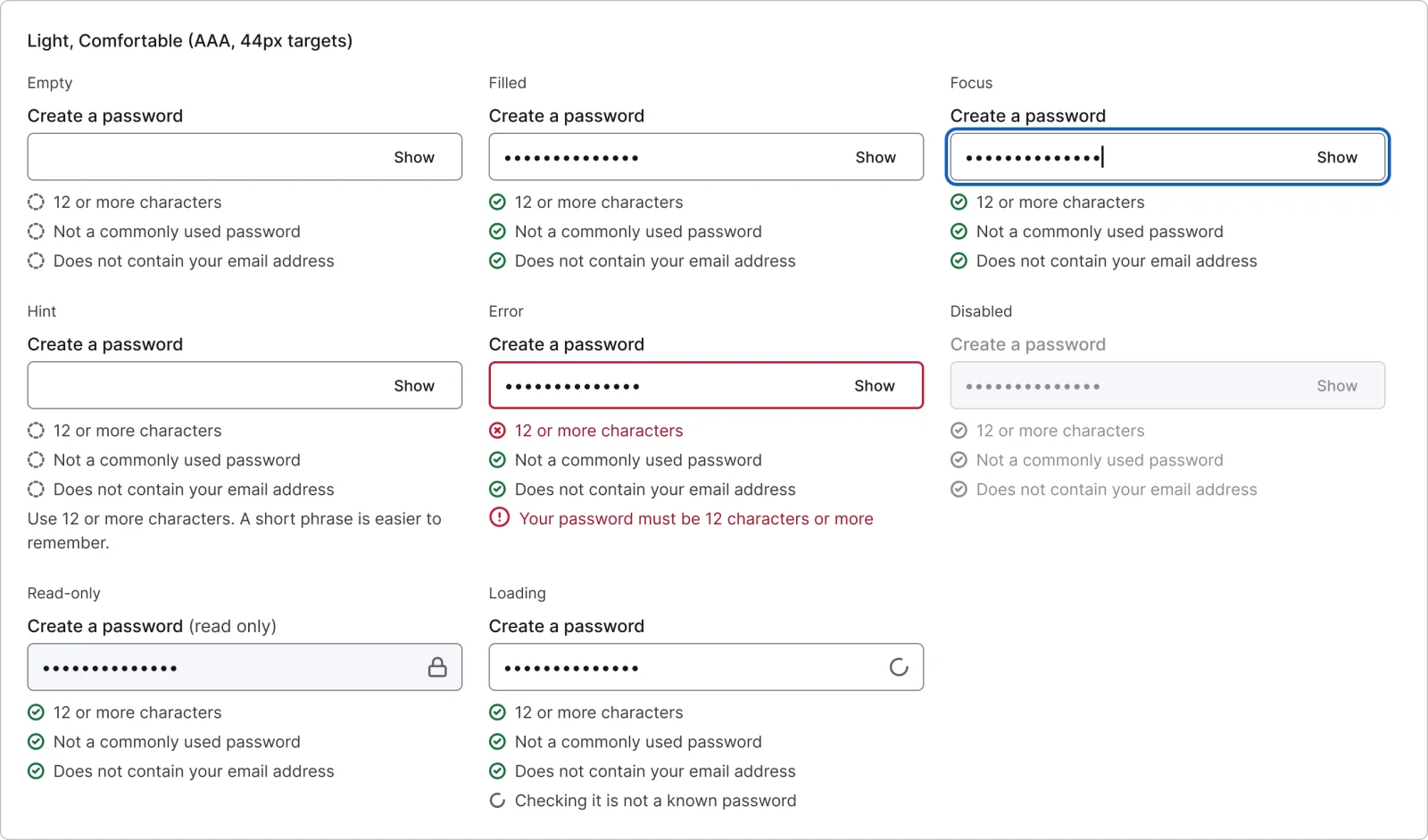
  • Password field, every variant

    Password field

    16 variants

    • Empty
    • Filled
    • Focus
    • Hint
    • Error
    • Disabled
    • Read-only
    • Loading
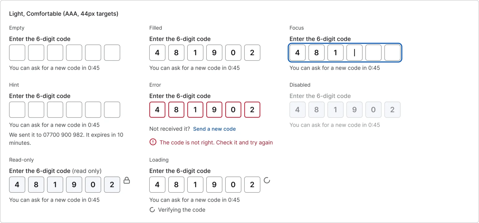
  • One-time code, every variant

    One-time code

    16 variants

    • Empty
    • Filled
    • Focus
    • Hint
    • Error
    • Disabled
    • Read-only
    • Loading
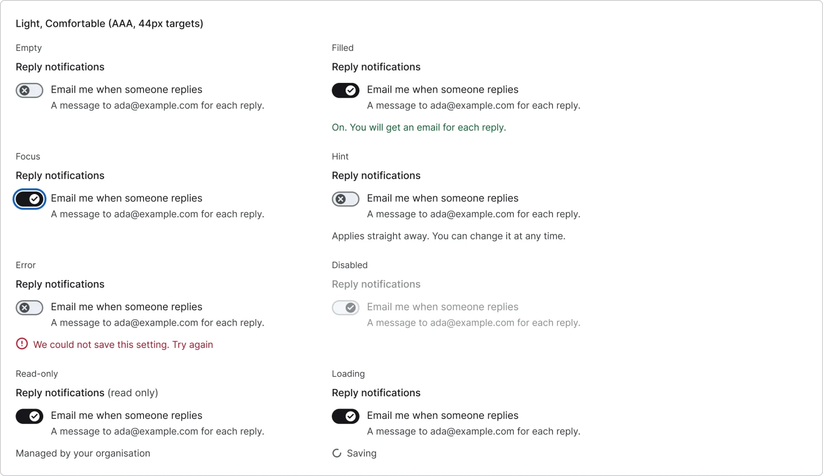
  • Switch setting, every variant

    Switch setting

    16 variants

    • Empty
    • Filled
    • Focus
    • Hint
    • Error
    • Disabled
    • Read-only
    • Loading
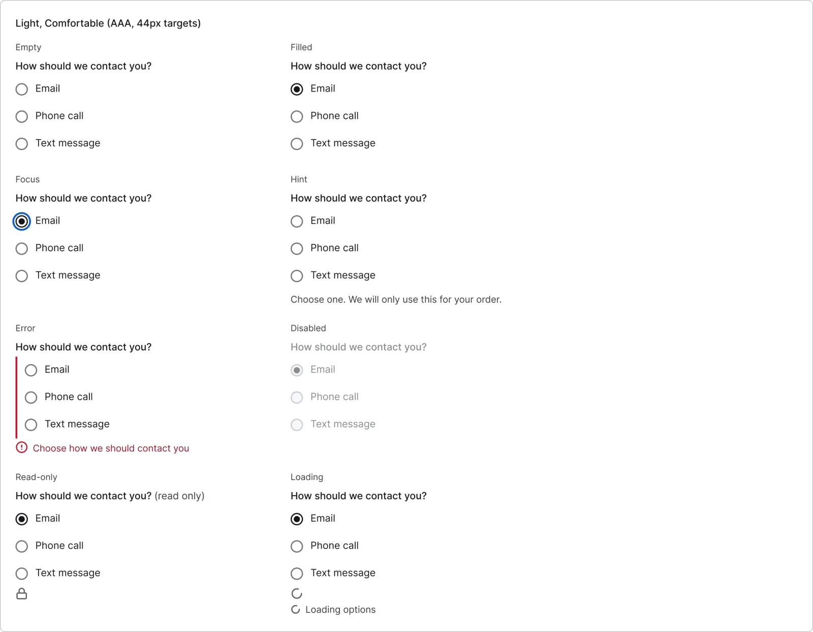
  • Radio group, every variant

    Radio group

    16 variants

    • Empty
    • Filled
    • Focus
    • Hint
    • Error
    • Disabled
    • Read-only
    • Loading
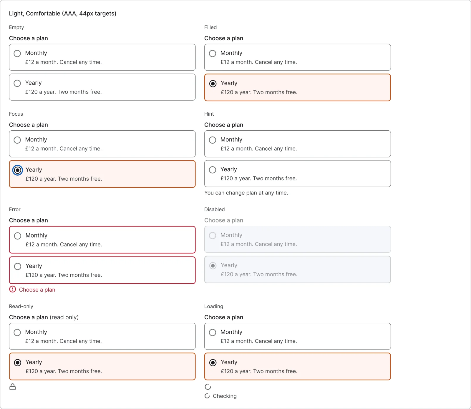
  • Radio cards, every variant

    Radio cards

    16 variants

    • Empty
    • Filled
    • Focus
    • Hint
    • Error
    • Disabled
    • Read-only
    • Loading
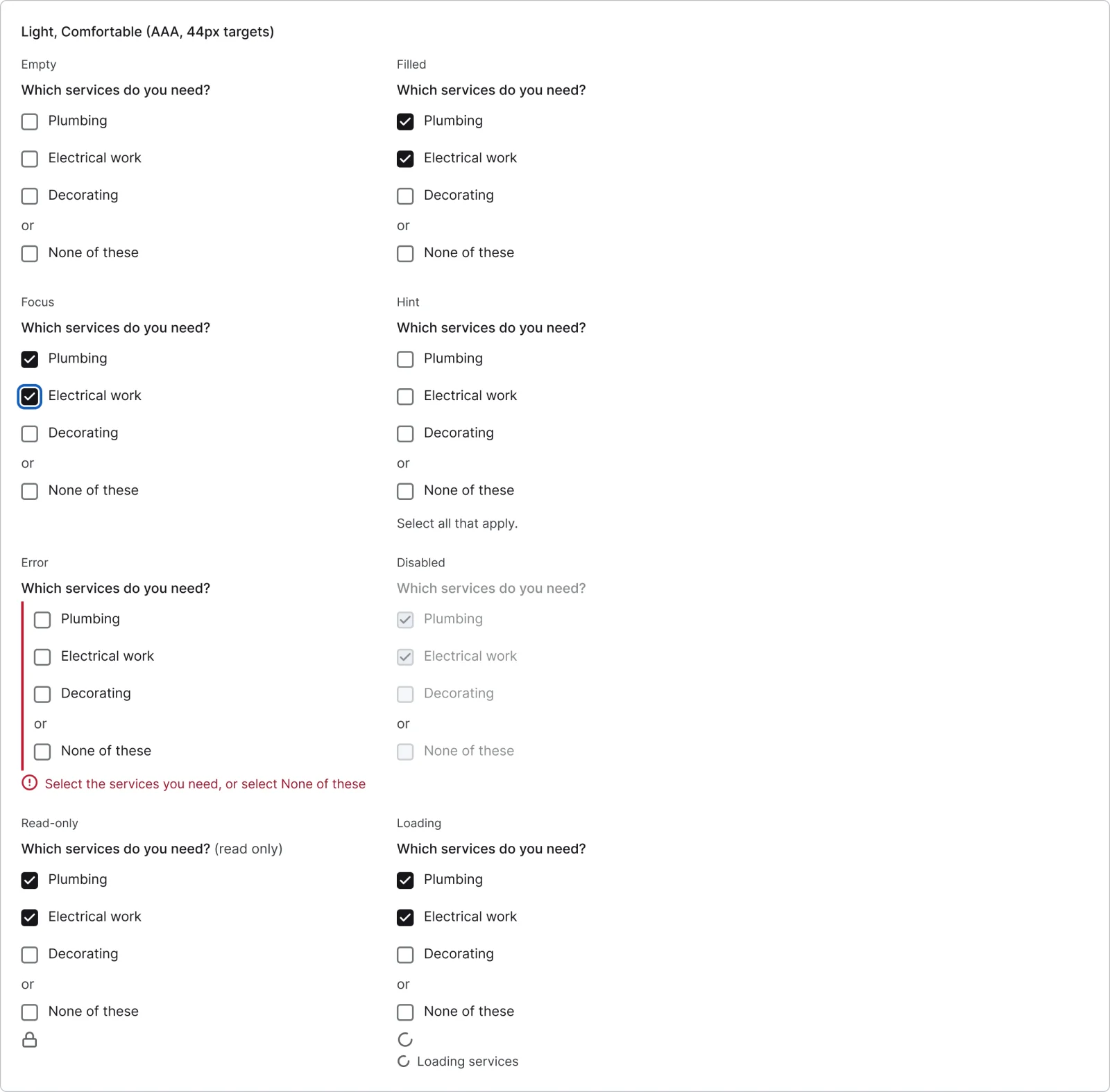
  • Checkbox group, every variant

    Checkbox group

    16 variants

    • Empty
    • Filled
    • Focus
    • Hint
    • Error
    • Disabled
    • Read-only
    • Loading
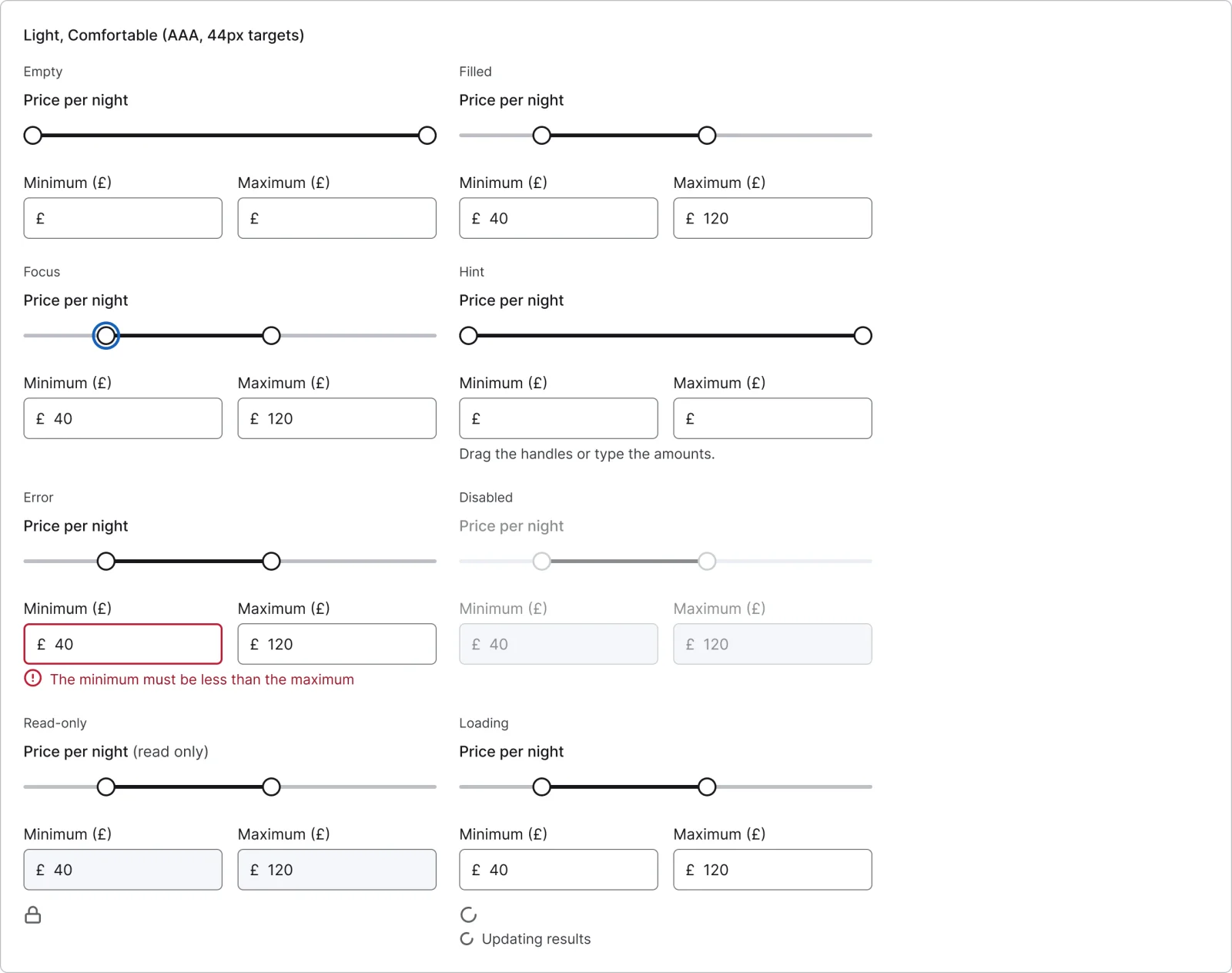
  • Range slider, every variant

    Range slider

    16 variants

    • Empty
    • Filled
    • Focus
    • Hint
    • Error
    • Disabled
    • Read-only
    • Loading
  • Inline status, every variant

    Inline status

    3 variants

    • Checking
    • Available
    • Taken
  • Error summary, every variant

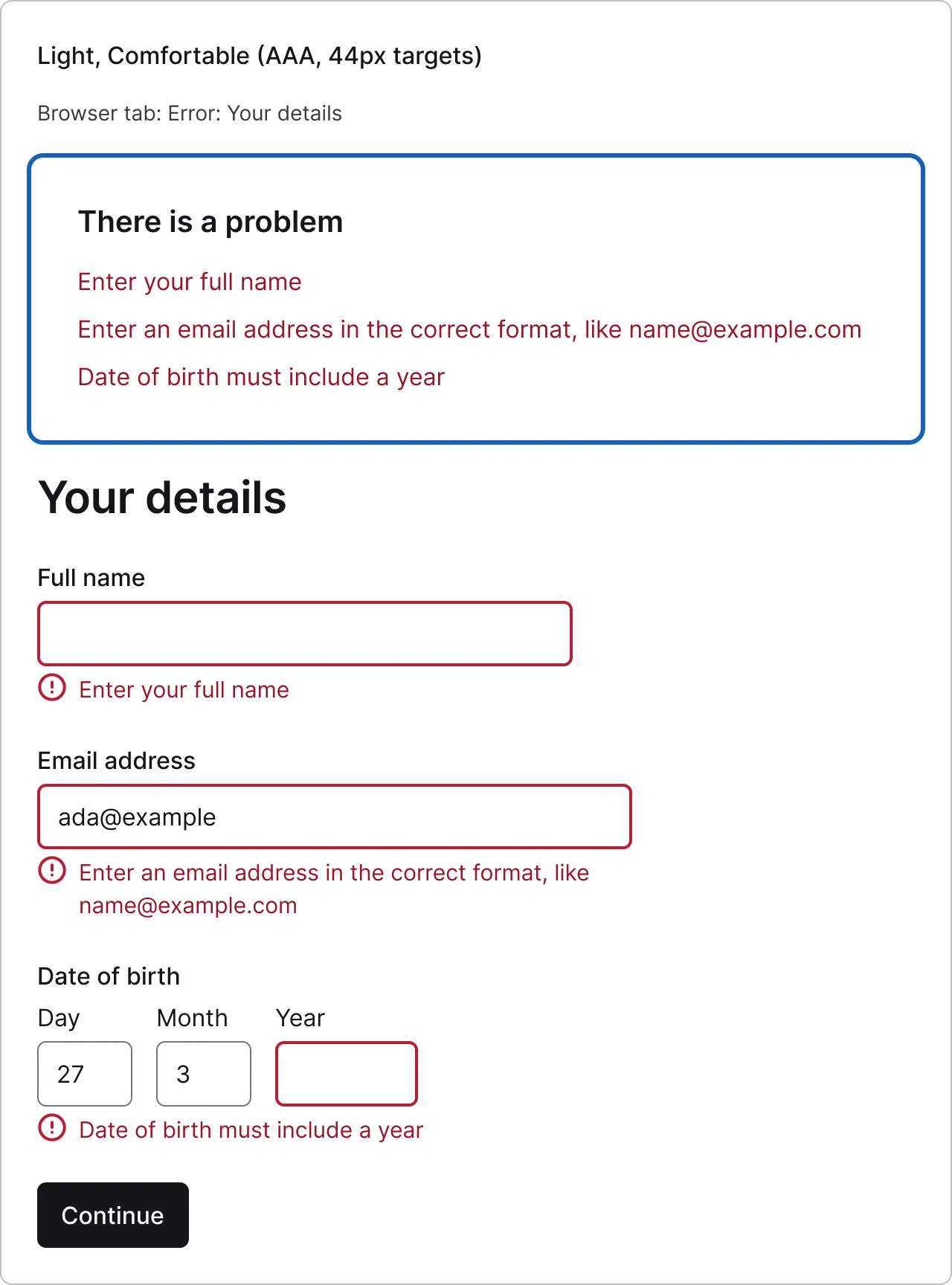
    Error summary

    4 variants

    • One
    • Several
    • Default
    • Focus
  • Single-column form, every variant

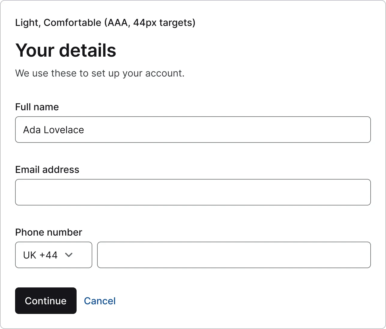
    Single-column form

    2 variants

    • Page
    • Dialog
  • Two-column form, every variant

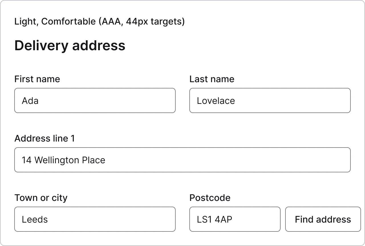
    Two-column form

    2 variants

    • Desktop
    • Narrow
  • Form sections, every variant

    Form sections

    1 variant

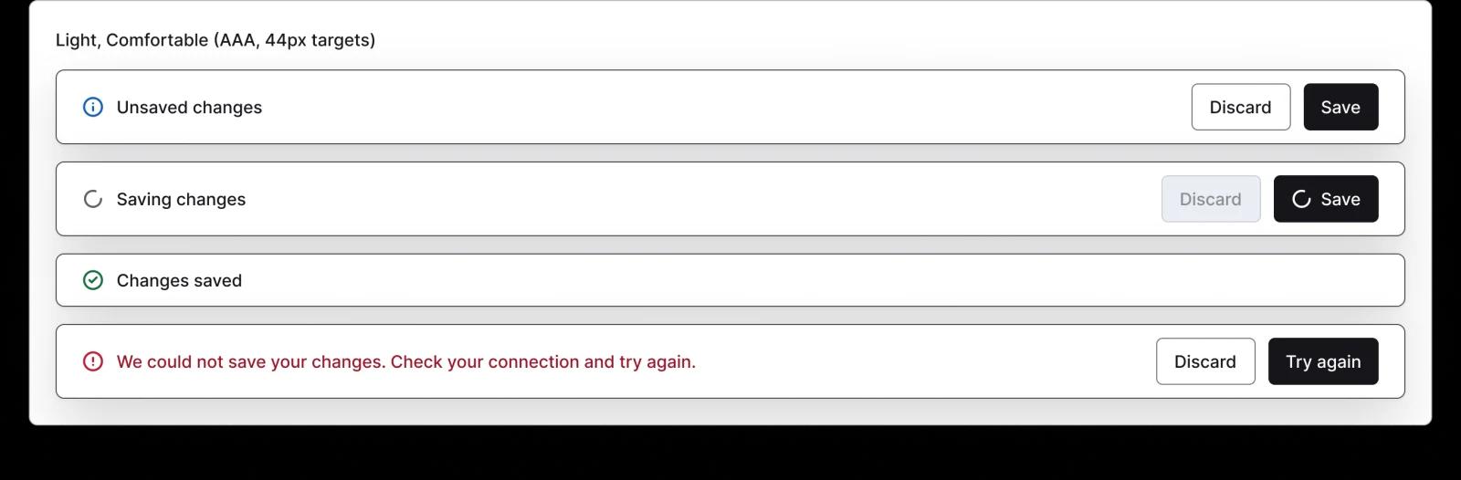
  • Save bar, every variant

    Save bar

    5 variants

    • Dirty
    • Saving
    • Saved
    • Error
  • Summary row, every variant

    Summary row

    1 variant

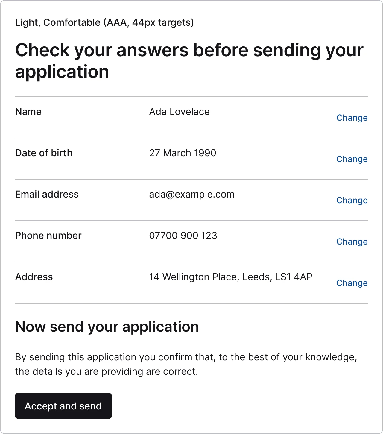
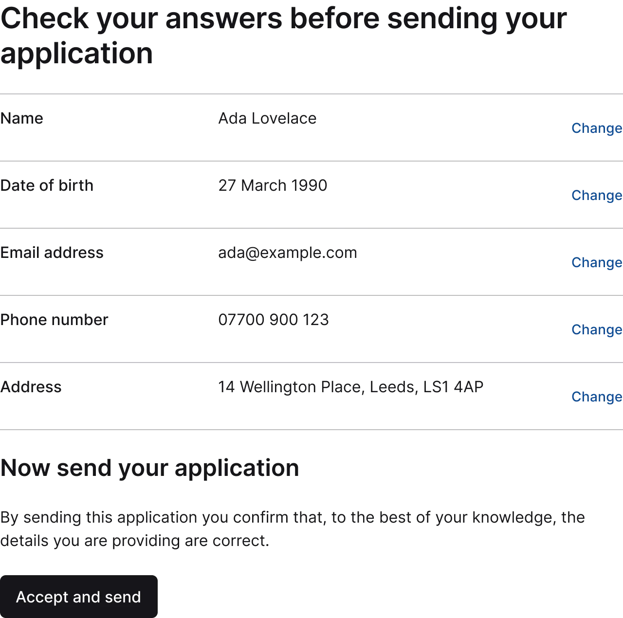
  • Check your answers, every variant

    Check your answers

    1 variant

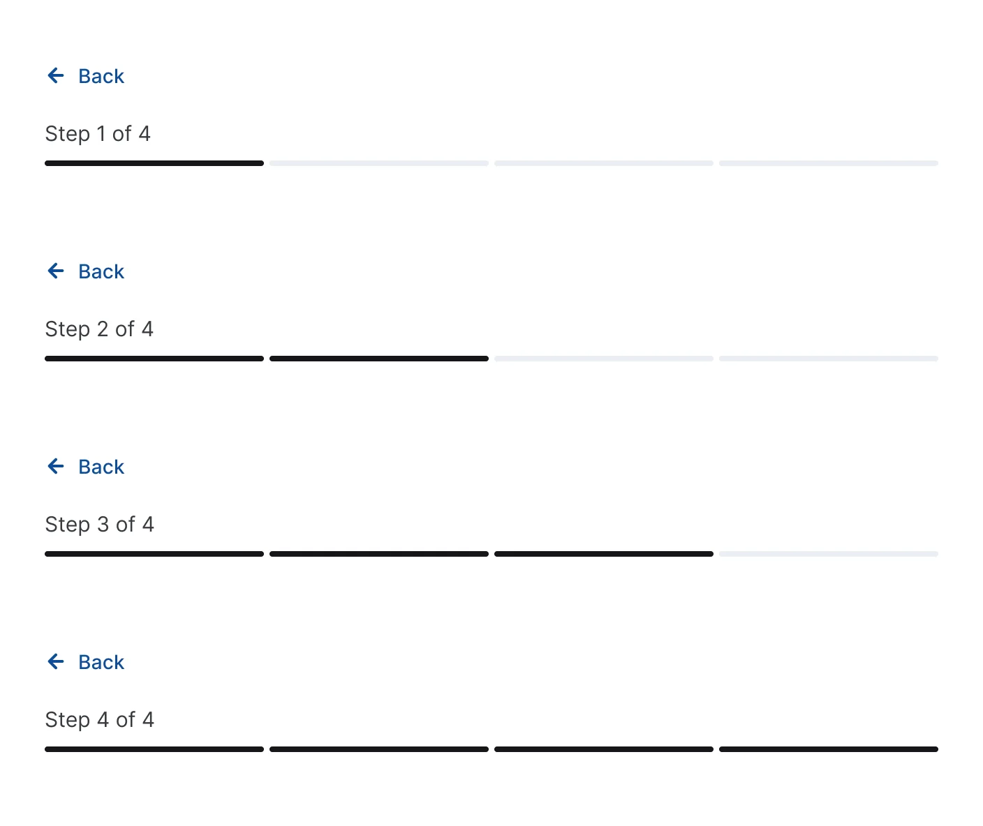
  • Step header, every variant

    Step header

    4 variants

Figma file
SuperDuper Packs - Forms (Desktop) - V1.0
Themes
Light, Dark, Light high contrast, Dark high contrast and Wireframe
Densities
Comfortable and Compact
Also in the file
Usage and accessibility notes, Figma variables
Covers 5 UI elements
Text field, Password field, Text area, Dropdown & select and Code input

How Stripe Checkout, Stripe Dashboard and GOV.UK Design System and others do it

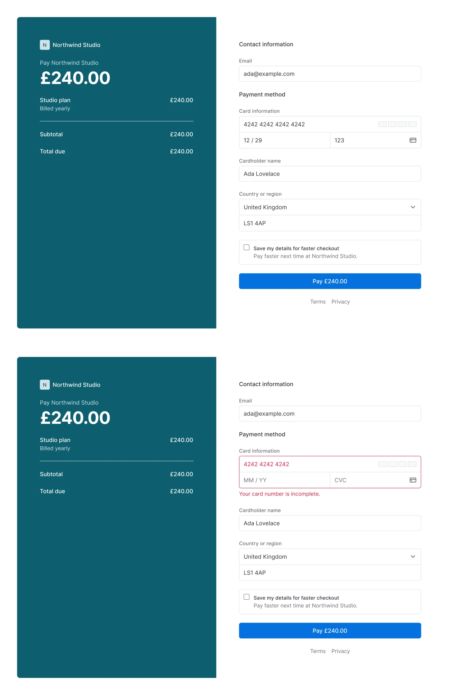
Recreations of real products, so you can compare approaches side by side. They are approximate, built from public product knowledge, with placeholder data and no third-party artwork.
  • Payments checkout, every variant

    Payments checkout

    Recreated from Stripe Checkout

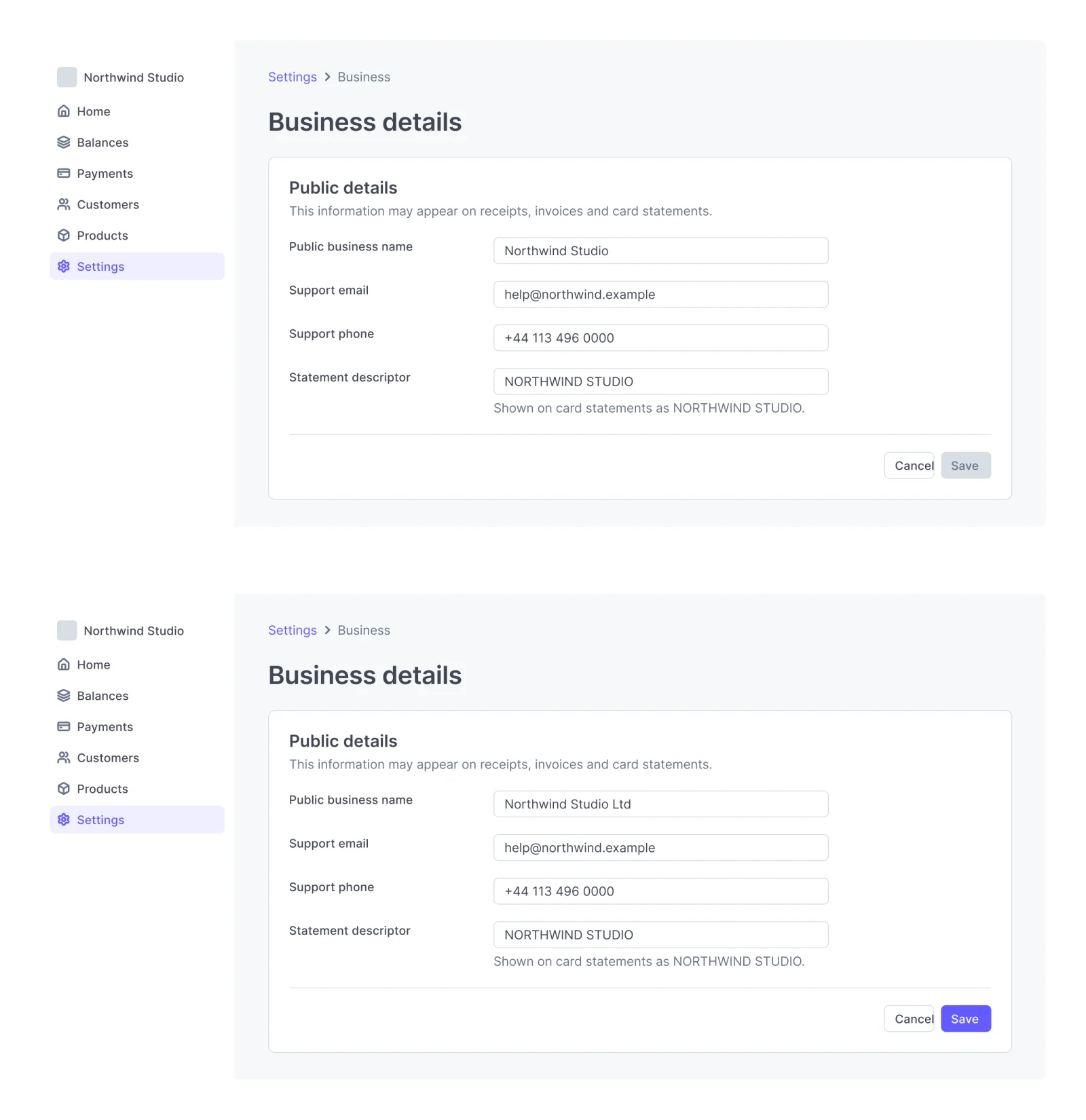
  • Payments settings, every variant

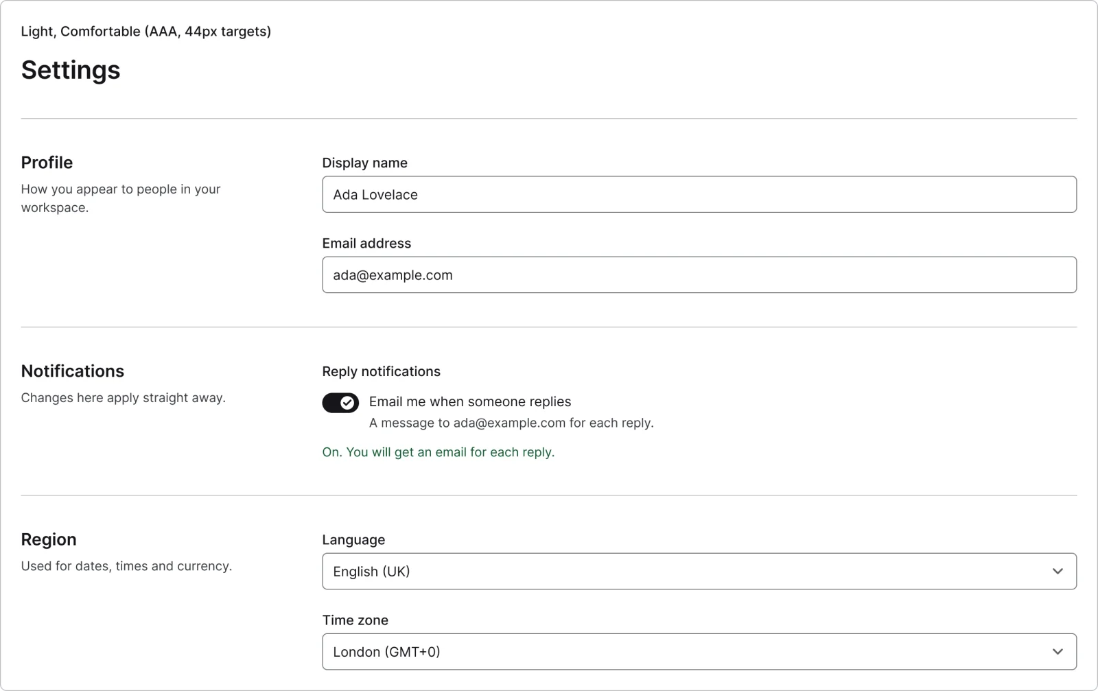
    Payments settings

    Recreated from Stripe Dashboard

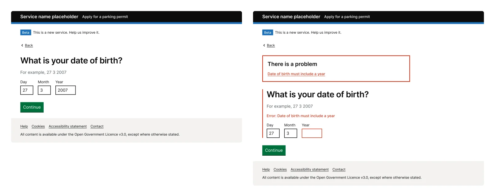
  • Government question page, every variant

    Government question page

    Recreated from GOV.UK Design System

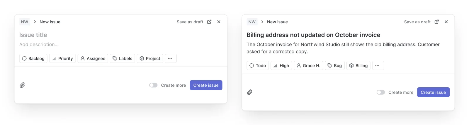
  • Issue create, every variant

    Issue create

    Recreated from Linear

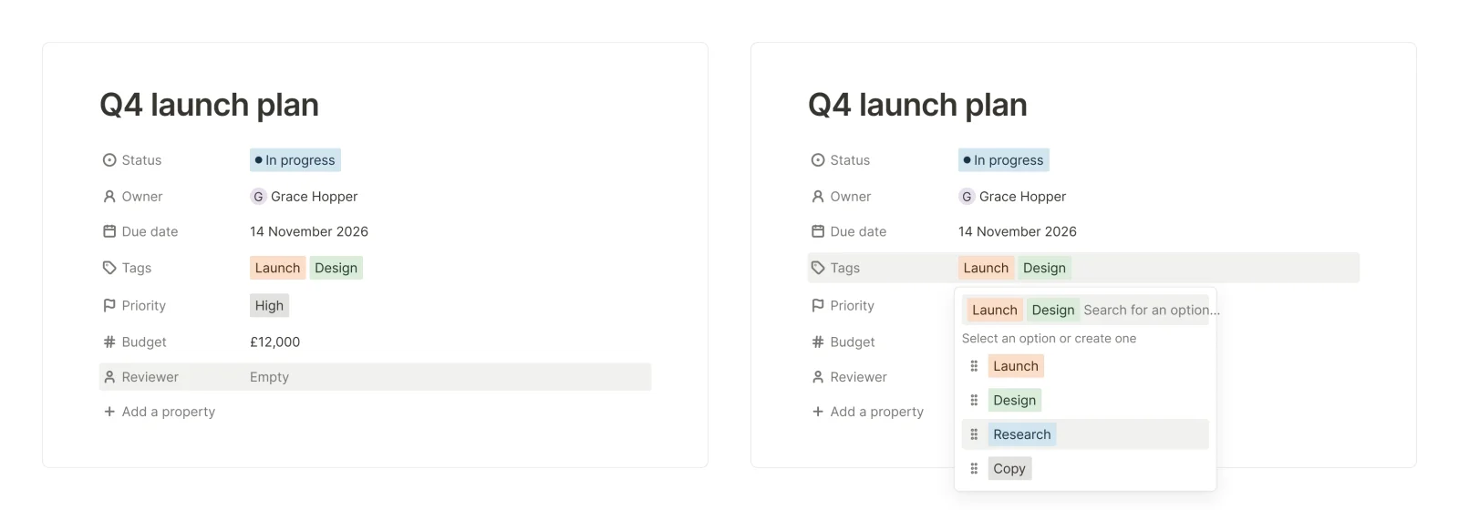
  • Docs properties, every variant

    Docs properties

    Recreated from Notion

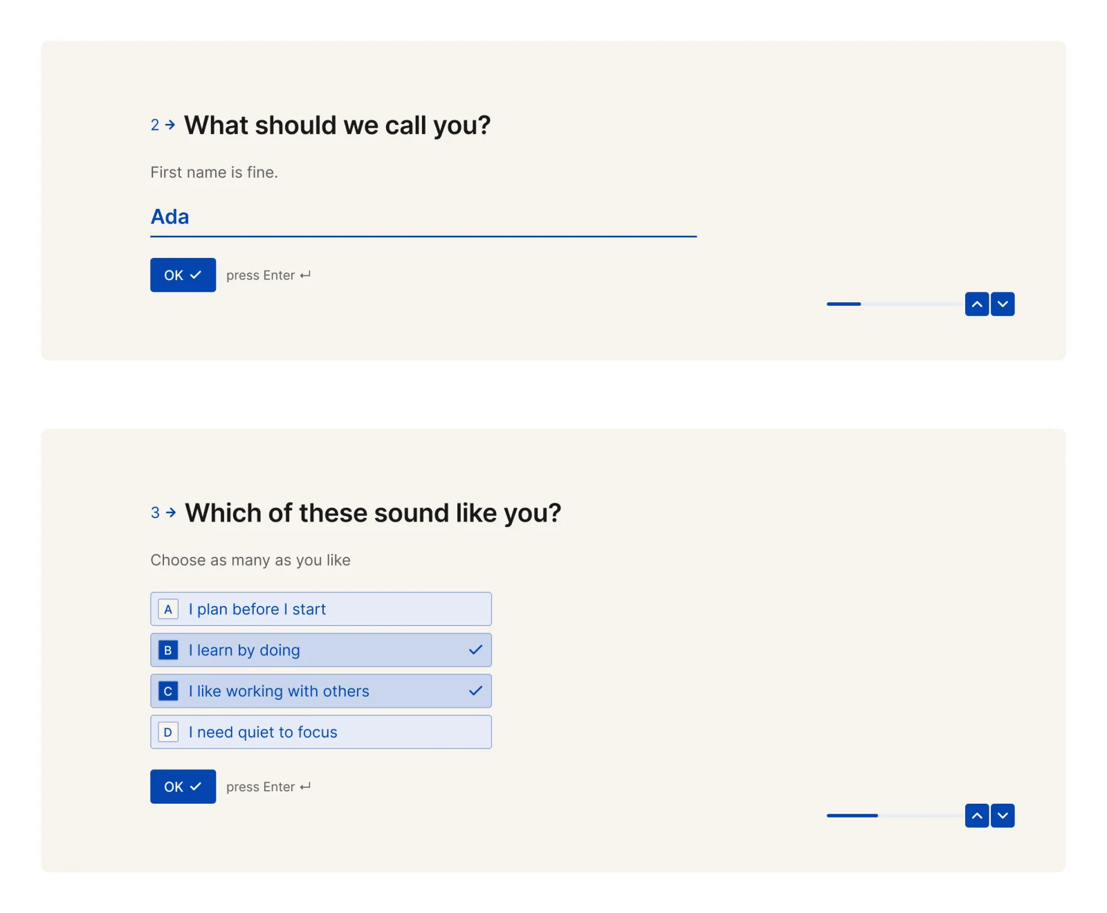
  • One question per step, every variant

    One question per step

    Recreated from Typeform

Not affiliated with, endorsed or sponsored by Stripe Checkout, Stripe Dashboard, GOV.UK Design System, Linear, Notion and Typeform. Their names are trade marks of their owners and are used only to say what each recreation is based on.

Text field, every variant

See the text field full size, free

A text field in all 8 states, from empty to loading, with the label shown or hidden. All 16 variants, free to see with a SuperDuperUI account. The Figma file comes with the pack.

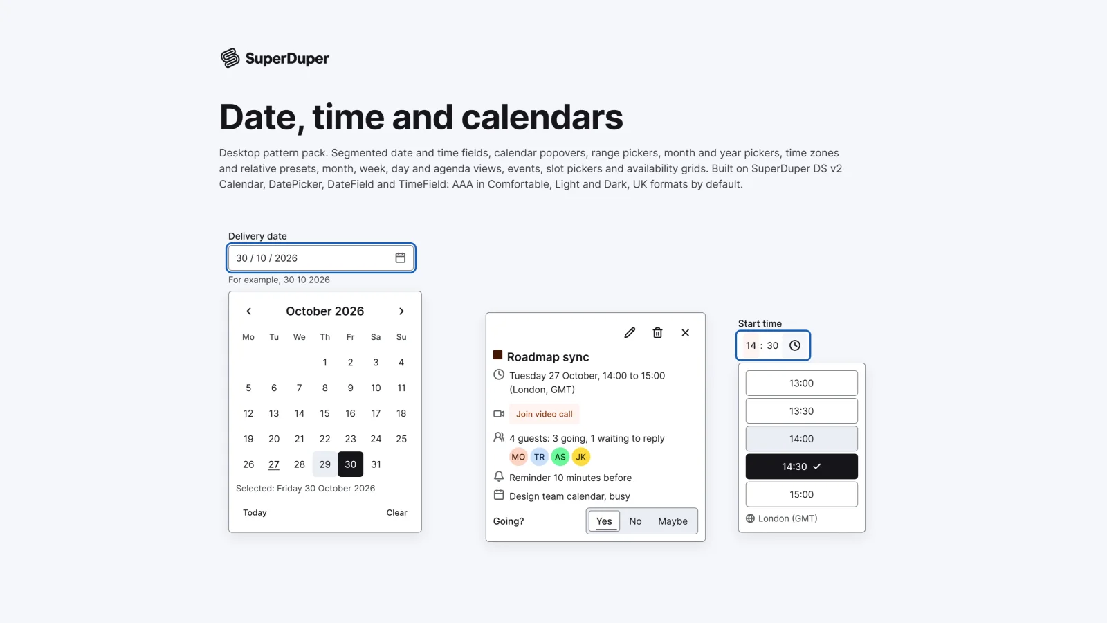
  • Date, time and calendars

    Desktop17 components73 variants4 recreations

    Desktop date and time fields, calendar and range pickers, time zones, month, week and day views, events and slot pickers.

    $9, or included with Pro
  • Search

    Desktop10 components34 variants4 recreations

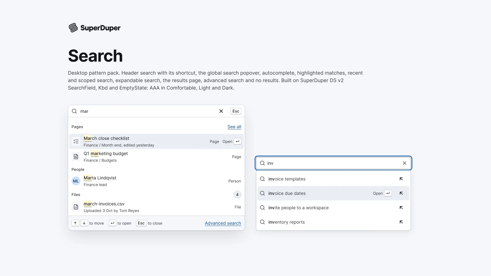
    Desktop search: header trigger, global popover, autocomplete, match highlights, recents, scoped search, results and no results.

    $9, or included with Pro
  • Selection controls

    Desktop13 components54 variants3 recreations

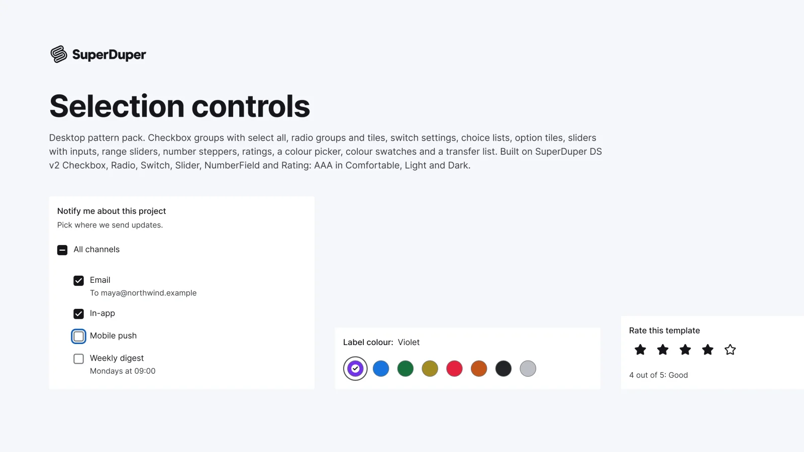
    Desktop checkbox and radio groups, setting switches, sliders, steppers, ratings, swatches, a colour picker and a transfer list.

    $9, or included with Pro

Questions about the form fields pack

  • One Figma file: SuperDuper Packs - Forms (Desktop) - V1.0. It has 30 components with 359 variants, 6 recreations, and notes on when to use each part. Everything uses Figma variables, so you can change the colours and type to match your product.